How to use padding vs. margin in CSS
Cascading Style Sheets, or CSS for short, are used to give a website a very individual look. With the padding and margin CSS elements, you can influence the layout of HTML elements and bring your website up to scratch in terms of styling.
HTML basics
To understand how CSS padding vs. margin affects the formatting and look of your website, you first need to know some HTML basics. In the markup language, you can create a whole range of different elements that end up appearing on a web presence. Within these elements, you need to distinguish between two groups: inline and block elements.
Inline HTML elements are those elements that flow together with the text of your website and do not require a paragraph of their own. Typical examples are the em or the b tag, which already ensure in the HTML script that the content between the opening and the closing tag is displayed as italic or bold in the web browser.
Unlike inline elements, their parent block elements require their own paragraph. You can think of block elements as a kind of box that spans the entire width of your screen. Similarly, you can naturally adjust the width and height of block elements so that the box shrinks or enlarges relative to the screen. Block elements can be aligned relative to each other and are essential components for the layout of a website. Typical representatives of this category of HTML elements are, for example, the headings h1 to h6 and the div container.
Don’t have your own website yet? No problem! With the help of IONOS, you can create your very own website in just a few minutes. With our web hosting, you’ll get your desired domain including SSL certificate and DDoS protection.
What is padding?
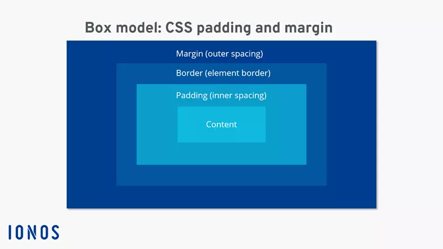
Once you’re familiar with the basic structure of various HTML elements, it’s easy to understand what exactly is meant by CSS padding. In short, padding refers to the internal spacing from the content of an element to the element boundaries. Again, it helps to think of block elements as boxes.
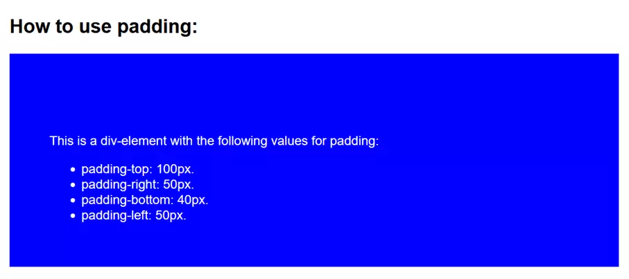
For example, when you create a div container, the CSS properties padding-top, padding-left, padding-bottom and padding-right each denote the distance of the textual content from the sides of the box created for that HTML element.
A code example in which we embed CSS in HTML will help to illustrate this:
<!DOCTYPE html>
<html>
	<head>
	<style>
		h2 {
		font-family: arial;
		}
		div {
		background-color: blue;
		padding-top: 100px;
		padding-left: 50px;
		padding-bottom: 40px;
		padding-right: 50px;
		color: white;
		font-family: arial;
		}
	</style>
	</head>
	<body>
		<h2>How to use padding:</h2>
		<div>This is a div-element with the following values for padding:
			<ul>
			<li> padding-top: 100px.</li>
			<li> padding-right: 50px.</li>
			<li> padding-bottom: 40px.</li>
			<li>padding-left: 50px.</li>
			</ul>
		</div>
	</body>
</html>The div container created by the above code looks like this:
Padding syntax
You can use CSS padding in several ways. One handy CSS trick is the use of shorthand notations. Different shorthand notations can help you compress your CSS code as needed.
Specify all four values
The simplest method is to specify the internal spacing you want to achieve for all four sides of the element. To do this, use the individual CSS commands padding-top, padding-left, padding-bottom and padding-right. You can also use the shorthand syntax:
padding: 100px 50px 40px 50px;Here you specify all four values in one command. The order is: padding top, padding right, padding bottom and padding left.
No matter which notation you choose, the size of your paddings can be specified with different units. If you choose to specify it in pixels, then this is a fixed value that will not change. For example, if you are working with CSS media queries and want your website to dynamically adapt to different screen sizes, this approach is unsuitable. You would have to specify new information for each screen size. To save yourself this effort, a percentage specification of the internal spacing is often used. The percentage refers to the box height or width.
Specify only three values
Depending on your intended use, you may not need all four values to customize padding for your website. Specifying only three values in the shorthand syntax of padding means that the first value is used for the inside distance to the top (padding-top), the second value is used for the inside distance to the sides (padding-right and padding-left), and the third value is used for the inside distance to the bottom (padding-bottom). This is especially handy when you want to center the content of an element on the horizontal axis.
Specify only two values
The specification of two values behaves analogously, where the first value is interpreted as the distance up and down and the second value as the distance to the right and left.
Specify one value
You guessed it: a single value specified after the padding CSS element causes the inside spacing to be identical to all four sides of your element. This way, you can perfectly center the content in your element.
What is margin?
If you learn CSS, you can’t avoid margin. This is also a CSS element used to customize the layout of individual HTML elements and your website. Unlike padding, margin refers to the outer distance that an element has from other adjacent elements or from the boundaries of your website. Fortunately, the syntax of margin is identical to the syntax of padding, so you only have to remember one notation.
Margin shorthand notations with four, three, two or only one value are also analogous to padding shorthand notations.
The best way to illustrate the outer margin is to use a simple code example in which two div containers are created:
<html>
	<head>
	<style>
		div {
		background-color: blue;
		margin-top: 10px;
		margin-bottom: 20px;
		width: 50%;
		height: 50px;
		font-family: arial;
		color: white;
		}
	</style>
  	</head>
	<body>
		<div>
		A div-container.
      	</div>
		<div>
		A second div-container. The spacing between the two containers is determined by margin.
     	</div>
  	</body>
</html>When to use padding or margin
Whenever you need to format content relative to its parent element, use padding. Whenever you need to place multiple elements relative to each other or relative to screen or window sizes, margin is your tool of choice. In practice, the two CSS commands rarely occur alone. Most of the time, padding and margin need to be combined to get the look you want for your website. This is easily done by naming both CSS elements in your HTML or CSS file and specifying the appropriate values.
If you want to focus entirely on the content of your web presence, the IONOS Website Builder will provide you with a whole range of professional templates. To create your business website we recommend MyWebsite Now with designs suitable for every industry and many more professional features.
The box model: CSS padding vs. margin
Want to learn more about different CSS commands? Our reading recommendations will help you:
- CSS tutorial
- CSS grid
- CSS flexbox
More articles about web development:
- Less
- SAAS
- YAML
- Modern web development
- 99.9% uptime
- PHP 8.3 with JIT compiler
- SSL, DDoS protection, and backups


