CSS Grid Tutorial
If you create a website, a significant portion of your time will go into the placement of the individual elements. The layout should look interesting, yet at the same time, be comprehensible through an intuitive and clearly-arranged presentation. Cascading Style Sheets (CSS) provide the tool for designing websites in a way that is appealing. While one rudimentarily tags their content with HTML, web designers tend to use CSS for complex layouts. The web technology is constantly being developed. With CSS3, new technologies have evolved to the point where the mark-up language can also be used for mobile Internet and responsive design.
What is the CSS Grid Layout used for?
The mobile Internet presents a significant challenge for web designers. That’s because they can’t know the format for the website’s display due to the variety of differently-designed mobile devices. For this reason, it’s important that the individual objects (text boxes, graphics, interactive elements) are distributed both independently and clearly – and indeed under special consideration of the particular spatial conditions that are specified by the display.
In the past, designers had to make do with so-called floats. However, the work performed with this technology was complex and error-prone. Now, there are two equally-valid methods for executing a dynamic layout: In addition to the CSS Grid you can also, for example, make good use of Flexbox in order to implement a smart design. However, both technologies differentiate themselves in certain aspects.
Flexbox is one-dimensional. The elements are, in principle, only moved along an axis. A CSS Grid Layout provides the web designer with two dimensions for placing objects. Instead of just one axis, with CSS Grid, you can use a grid that has rows and columns.
CSS Grid: Tutorial with examples
Anyone who already has experience with CSS will not have any problems with Grid. In the following tutorial, we describe the most important features to get started.
The tutorial works with a single file. The CSS code is written directly in the head of the HTML file. However, it’s also possible to create a separate stylesheet and only view this in the HTML file.
Creating Containers and Items
CSS Grid is familiar with two different units: containers und items. The container is the upper level where one determines properties that are then passed on to all items. An item thus lies (viewed hierarchically) within a container. However, you still need HTML for the grid layout. In the HTML section of the source text, the individual objects (e.g. text, graphics) are produced that are then captured within CSS Grid and brought to the correct position.
<!DOCTYPE html>
<html>
<head>
<style>
.grid-container {
    display: grid;
}
</style>
</head>
<body>
<div class="grid-container">
    <div class="grid-item1">1</div>
    <div class="grid-item2">2</div>
    <div class="grid-item3">3</div>
    <div class="grid-item4">4</div>
    <div class="grid-item5">5</div>
    <div class="grid-item6">6</div>
</div>
</body>
</html>
As a result, we have now created six elements, each one defined as a “grid-item” and all of them packed into the “grid-container.” To active CSS right from the start, you must launch the “display:-grid” function in the container. So far, the code has only created six numbers that appear among each other. Once these items have been created, however, they can be moved around on the screen relatively freely.
Grid, columns, and rows
With CSS Grid, you’ll work with rows and columns and in this way produce a grid. Within the grid, individual objects can be arranged. This grid can or must be freely selected. The user decides the scope of the rows and columns. For this purpose, you would add two commands to the container.
.grid-container {
    display: grid;
    grid-template-rows: 100px 100px;
    grid-template-columns: 100px 100px 100px;
}
With both these commands, we have opened a 2x3 grid. As you can see, the size of every row and column can be adjusted individually. The specifications are simply entered successively (separated by a space). In addition to the exact pixel specification, you can also use a percentage share or other size types that are customary to CSS. With the “max-content” and “min-content” specifications, you can also generate the grid in relation to the content.
You could also create a gap using the “grid-gap” command.
.grid-container {
    display: grid;
    grid-template-rows: 100px 100px;
    grid-template-columns: 100px 100px 100px;
    grid-gap: 5px;
}
As a result, the cells are separated from each other with an equal amount of distance. Anyone who does not wish to have any standard distance between the units can also the configure the gaps by entering “grid-column-gap” and “grid-row-gap.”
Fractions are a unique feature. As was the case with the percent specifications, the screen can be separated into separate parts with this measuring unit. Let’s say we would like to divide up the area into seven horizontal units. However, a separate column needs to be twice as large as the others. This can be implemented via the following code:
.grid-container {
    display: grid;
    grid-template-rows: 100px 100px;
    grid-template-columns: 1fr 2fr 1fr 1fr 1fr;
    grid-gap: 5px;
}The advantage of working with relative sizes instead of static specifications is the following: The grid can automatically be adapted to the screen size. Even if the individual columns have to be smaller, the second column always remains (in our example) twice as large as the others. If you would like to permanently set the size of a row, that is, not adjust it to the screen, simply give this line a static value.
Placement of elements
After you have defined the grid, you can place the different objects. To do this, you must create items and specify the start and end values as well. However, it is not compulsory that every element take up only one cell within the grid.
<!DOCTYPE html>
<html>
<head>
<style>
.grid-container {
    display: grid;
    grid-template-rows: 100px 100px 100px 100px;
    grid-template-columns: 100px 100px 100px 100px;
    grid-gap: 5px;
}
.grid-item1 {
    background: blue;
    text-align: center;
    border: black 5px solid;
    grid-column-start: 1;
    grid-column-end: 5;
    grid-row-start: 1;
    grid-row-end: 3;
}
.grid-item2 {
    background: grey;
    text-align: center;
    border: black 5px solid;
}
</style>
</head>
<body>
<div class="grid-container">
    <div class="grid-item1">1</div>
    <div class="grid-item2">2</div>
    <div class="grid-item2">3</div>
    <div class="grid-item2">4</div>
    <div class="grid-item2">5</div>
    <div class="grid-item2">6</div>
</div>
</body>
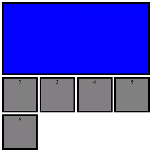
</html>We have now introduced two item types. While the last six elements automatically have only the span of a cell, the first object stretches over four columns and two rows. (For more clarity, our examples also contain another visual layout. However, you wouldn’t define colouring, frameworks, and text centring via CSS Grid alone.)
The values for the start and end of the objects only indirectly refer to the rows and columns. In fact, you are referring to the respective grid lines. In the example, the fourth column ends with the fifth line. However, you have different options to specify the span.
- Numbering: One enumerates the lines from left to right and from top to bottom.
- Names: Within the “grid-template-rows” and “grid-template-columns” one can assign names to the lines (in square brackets) and then refer to these designations.
- Spans: With “span” one specifies how many cells the object should comprise in the corresponding direction.
Instead of defining start and end points respectively in a separate command, web designers can combine both under one command. The following code leads to the same result as the previous example.
<style>
.grid-container {
    display: grid;
    grid-template-rows: 100px [Line1] 100px [Line2] 100px [Line3] 100px [Line4];
    grid-template-columns: 100px 100px 100px 100px;
    grid-gap: 5px;
}
.grid-item1 {
    background: blue;
    text-align: center;
    border: black 5px solid;
    grid-column: 1 / span 4;
    grid-row: 1 / Line2;
}
.grid-item2 {
    background: grey;
    text-align: center;
    border: black 5px solid;
}
</style>
Allocation of areas
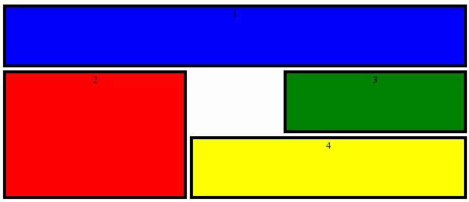
In the CSS Grid it is possible to merge cells into areas and name them. This makes the distribution of the individual elements within the grid somewhat easier. You can perform the setup for this in the container. To do so, use the “grid-template-areas” command and then write line for line the desired area names in the cells. If you don’t wish to assign a cell and thus leave it empty long-term, just insert a period here. Every line is bracketed with quotation marks.
.grid-container {
    display: grid;
    grid-template-rows: 100px 100px 100px;
    grid-template-columns: 1fr 1fr 1fr 1fr 1fr;
    grid-gap: 5px;
    grid-template-areas:
    "area1 area1 area1 area1 area1"
    "area2 area2 . area3 area3"
    "area2 area2 area4 area4 area4";
}
In this CSS Grid example, we have defined four different areas. One cell has remained open. If you now define the items, you don’t need to specify a from-to value. It is enough to refer to the appropriate area.
.grid-item1 {
    background: blue;
    text-align: center;
    border: black 5px solid;
    grid-area: area1;
}
.grid-item2 {
    background: red;
    text-align: center;
    border: black 5px solid;
    grid-area: area2;
}
.grid-item3 {
    background: green;
    text-align: center;
    border: black 5px solid;
    grid-area: area3;
}
.grid-item4 {
    background: yellow;
    text-align: center;
    border: black 5px solid;
    grid-area: area4;
}Adjust alignment
How are the individual elements aligned within the CSS Grid? The standard is that the individual elements are expanded in such a way that they fit exactly inside the grid. That’s why item size does not play a role and was, therefore, not specified in the examples we’ve used up to this point. Instead, we specified across which cells the object will be distributed. However, you could assign the item a fixed size and would still want to integrate it into the grid.
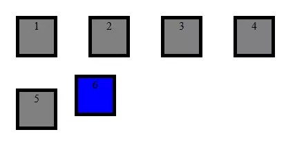
Web designers have the option to either set the alignment of all items globally via the container or instead give selected objects a specific alignment. For the global variant, designers use “justify-items” and “align-items”. The former adjusts the horizontal alignment, the latter, the vertical one. If you want to align an individual item, you can use the “justify-self” and “align-self” commands. All commands, however, contain the same options.
- stretch: The object size is adapted to the size of the selected cells.
- start: The object aligns itself to the left or to the top.
- end: The object aligns itself to the right or to the bottom.
- center: The object is centred.
.grid-container {
    display: grid;
    grid-template-rows: 100px 100px 100px 100px;
    grid-template-columns: 100px 100px 100px 100px;
    grid-gap: 5px;
    justify-items: center;
    align-items: center;
}
.grid-item1 {
    background: grey;
    text-align: center;
    border: black 5px solid;
    width: 50px;
    height: 50px;
}
.grid-item2 {
    background: blue;
    text-align: center;
    border: black 5px solid;
    width: 50px;
    height: 50px;
    justify-self: start;
    align-self: start;
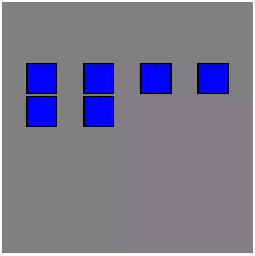
}place-items: center / end;It’s also possible to align the objects in the grid, though one can also move the complete grid within the container. If you tend to work with static size indications for the CSS Grid, the grid sometimes doesn’t have the same size as the container. In that case, you can align the grid within the container – and thus within the display – by using ‘justify-content” and “align-content”. There are different alignment options:
- start: aligned to the left or to the top
- end: aligned to the right or to the bottom
- centre: aligned to the center
- stretch: extended grid
- space-around: equal distribution of space around the cells
- space-between: equal distributions of space between the cells
- space-evenly: equal distribution of space around the cells including the margin
.grid-container {
    display: grid;
    width: 800px;
    height: 800px;
    background: yellow;
    grid-template-rows: 100px 100px 100px 100px;
    grid-template-columns: 100px 100px 100px 100px;
    grid-gap: 5px;
    justify-content: space-evenly;
    align-content: center;
}place-content: center / space-evenly;Automatic fitting for responsive designs
A crucial advantage of CSS Grid is the grid’s flexibility. You can set up CSS Grid in such a way that it automatically adjusts. This improves the display on different devices: automatisms also help make working with CSS easier.
One helpful function is called “repeat()”. Instead of every row or column being defined individually, you can make a size specification and define how often this formula is to be repeated. That’s even easier to do in combination with the “auto-fill” and “auto-fit” options. In doing so, you let CSS Grid take care of creating rows and columns. With the first option, CSS Grid inserts as many cells as possible, without pushing the borders of the container. This can result, however, in space that remains unused. The “auto-fit” option, in contrast, adjusts the size of the individual cells in such a way that space is utilised up to the margin.
.grid-container {
    display: grid;
    width: 800px;
    height: 800px;
    grid-template-rows: repeat(auto-fit, 100px);
    grid-template-columns: repeat(auto-fit, 100px);
    grid-gap: 5px;
}
Both the “grid-auto-columns” and “grid-auto-rows” functions are also very helpful. With both of these commands one has more freedom when creating items. If a grid were to have, for example, the dimension of 4 x 4 cells, and one were to generate an item that would only begin in the fifth column, that would lead to problems. Through the automatic creation of sufficient rows and columns you can prevent such problems.
.grid-container {
    display: grid;
    grid-auto-rows: 100px;
    grid-auto-columns: 100px;
    grid-gap: 5px;
}
Even if the size of the grid and objects is supposed to adjust to the display, web designers like to enter the minimum and maximum values. With the “minmax()” command, you can be sure that an item will not be too small or too big. To achieve this, you can firstly enter the smallest value in the brackets, followed by the largest one.
.grid-container {
    display: grid;
    grid-template-rows: 100px 100px 100px;
    grid-auto-columns: minmax(50px, 150px);
    grid-gap: 5px;
}
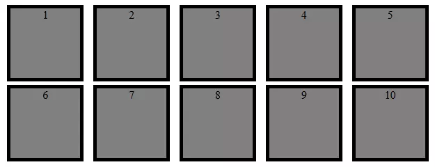
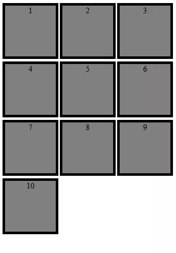
If you now combine together several of the functions we’ve introduced, you can easily create a responsive design.
<!DOCTYPE html>
<html>
<head>
<style>
.grid-container {
    display: grid;
    grid-template-columns: repeat(auto-fit, minmax(100px, 1fr));
    grid-gap: 5px;
    justify-items: center;
    align-items: center;
}
.grid-item1 {
    background: grey;
    text-align: center;
    border: black 5px solid;
    width: 100px;
    height: 100px;
}
</style>
</head>
<body>
<div class="grid-container">
    <div class="grid-item1">1</div>
    <div class="grid-item1">2</div>
    <div class="grid-item1">3</div>
    <div class="grid-item1">4</div>
    <div class="grid-item1">5</div>
    <div class="grid-item1">6</div>
    <div class="grid-item1">7</div>
    <div class="grid-item1">8</div>
    <div class="grid-item1">9</div>
    <div class="grid-item1">10</div>
</div>
</body>
</html>CSS Grid gives web designers the opportunity to create appealing layouts with little effort. Thanks to the grid, you always have control over the placement of objects – even when it’s a responsive design.


