9 email marketing trends for 2025
Email marketing is an important tool to inform your customers of offers, new products, or special promotions. Technical developments and changed user behavior mean that you have to regularly adapt your strategy to stay up to date. You might already be familiar with some of these trends — a sign that they are becoming more and more important. Other methods, such as A/B testing or smartphone optimization, have become so commonplace when it comes to newsletters that they don’t need to be explained in this article.
These are the 9 email marketing trends of 2025
Generally, this year’s email marketing trends are also aimed at inspiring readers and challenging them with new ideas. The biggest challenge with newsletters is providing users with useful content and original advertising messages. Data protection is a growing challenge here. That's why you need to find ways to measure success in a way that does not disrupt user privacy.
- Accessibility
- Omnichannel marketing
- Automation
- User-generated content
- Interactive content (gamification)
- Plain text emails
- Artificial intelligence (AI)
- Data protection and privacy
- New KPIs
- Fast drag and drop editing
- Simple personalization
- AI-powered text generation
Accessibility
Your clientele is diverse, and your newsletter should reflect that. So, make sure to design emails in a way that all recipients feel addressed and can access the content. This includes people with visual impairments. Therefore, don’t get too creative with the color selection, and ensure strong contrasts. This helps both people with visual impairments and those who are color blind. Enough white space, i.e., blank spaces, visually structures the text and makes it even easier to read.
Also, assume that people with no eyesight at all are among the recipients of your newsletters. Blind people often use a screen reader. This software captures the content on the screen and then reads it aloud. So, for your newsletter content to be expressed, it must also be perceived as text. That’s why you shouldn’t exclusively place content in graphics. For HTML newsletters, use additional alt texts that put the image content into words.
For newsletters, you can follow the same tips that apply to accessible websites:
- Clear text design with plenty of whitespace
- High contrast and restrained color design
- Correct HTML formatting
- Meaningful alternative texts for images
- Clearly recognizable buttons and links
However, accessibility can also refer to the language used. Not every mail recipient can decode nested sentences and understand foreign words. If you offer a version in simple language in addition to the detailed text, you will actively be promoting inclusion.
Omnichannel marketing
A growing trend for companies is the omnichannel-marketing approach. This means your newsletters should become a puzzle piece within an omnichannel marketing strategy that covers all the relevant channels (digital, analog and physical), rather than a stand-alone means of customer communication.
Email marketing is arguably the most important constant in an omnichannel marketing strategy. Newsletters are an effective tool for customer retention and are known to have a high ROI (return on investment). You gain valuable insights about your target group(s) that can directly be applied to actions on other channels. In addition, there is a high level of flexibility when designing your email campaign: you can test different strategies and adjust the goals you are pursuing easily.
Give your newsletters an individual touch and a feeling of exclusivity by creating your own email address with IONOS. You’ll benefit from features such as virus protection and modern spam filters as well as a forwarding service and e-mail archiving.
Automation
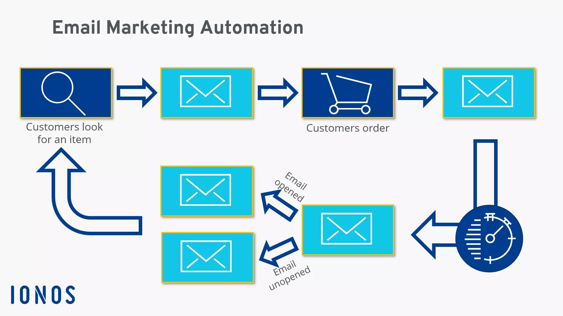
While automation is not a new email marketing trend, it is a continuing one and it is becoming increasingly important. In the past, it might have been sufficient to send a message once a week and schedule a dispatch date in advance. But now it’s simply not enough. Good automation reacts to users’ behavior. This way, you can accompany different users in their purchase decisions.
Good newsletter automation works via triggers. Depending on how your customers act (or don’t act), you send an automated, prepared email. Simple triggers can be registration or purchase, for example, after which you send a confirmation. But it can be more complex if you build chains and let them branch out. For example, with well-set automation, you send different messages depending on whether the reader opened your last newsletter or it ended up unopened in the trash. A/B tests can also be perfectly controlled by way of email automation.
Thanks to automation, you can get two things done at once: on the one hand, you can react much faster and more individually to each user. Depending on how your customers act online, you can prepare the right email for them and can send it in real-time. On the other hand, you save resources because automation processes mean you need less time and fewer staff members to run effective email marketing.
User-generated content
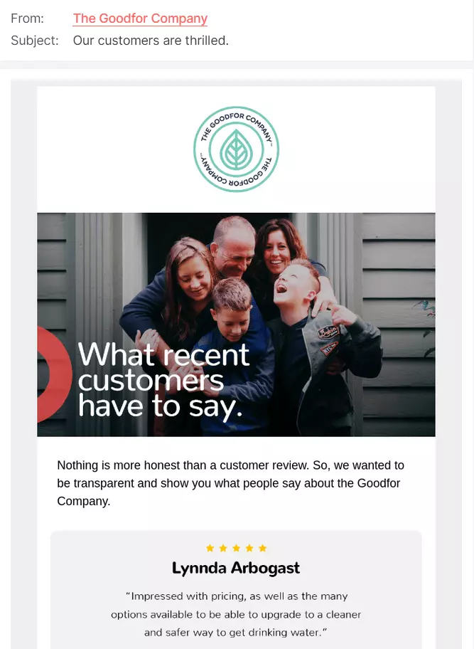
Trying to convince readers of products or services is always a challenge, regardless of how well you have designed your newsletter. The reality is that you cannot beat the persuasiveness and trustworthiness of reviews and opinions from other users. User-generated content can be a real marketing asset and including it is an important email marketing trend in 2025.
Another option to make your newsletters more personal is to include content from users or customers. The most popular method involves adding customer reviews into emails. A positive comment about your products or services in the introduction of your newsletter will immediately reflect positively on your readers and spark interest. More detailed reviews are well received because they take the reader's perspective and are thus more credible than traditional advertising messages.
You can also incorporate user-generated content into your email marketing campaign by engaging your readers through a survey and collecting informative data on their shopping preferences etc. Add a call to vote into the first email and follow it up with the survey in your subsequent newsletter. You can personalize it even more by organizing challenges, for example, on social networks and then present the winners in your newsletter.
Email marketing and user-generated content (UGC) go hand in hand: Newsletters lend themselves to showcasing UGC, but they are also an effective tool for collecting contributions from users. An automated and timed email following a purchase may entice customers to leave a review.
Interactive content (gamification)
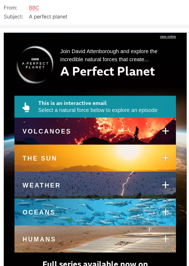
Another email trend is aimed at interactive content. This means that users can influence the content when reading the email. This is based on the idea of gamification: typical game elements that challenge the reader are inserted into the email. The principle works because the user experiences a sense of success from playing and doing well, even though they don’t technically get anything for winning. However, you can create incentives, if you so choose, by distributing small prizes, such as coupons, as a reward.
But it doesn’t always have to be a game. Anything a reader can click on will increase their interest. For example, several tabs can be integrated within an email so that the reader can click through the offer. In the spirit of user-generated content, surveys can be filled out directly in an email for great results. This gives you a double advantage: on the one hand, you can collect interesting data from the survey and on the other hand, your email will get more attention.
Not every user can display interactive elements correctly, so make sure your e-mail looks acceptable and interesting to read even without these elements present. You can also provide a link so that the content can be displayed in the browser.
Plain text emails
Although interactive and elaborative content is part of our list of successful email marketing trends in 2025, you might notice that a countermovement is happening at the same time: some marketers are going back to plain text emails. This is because they want to ensure that all users see the email as it’s intended to be seen. The benefits are that users don’t need to download any graphics, for example.
However, the option deprives you of plenty of design options to attract attention which means you’ll need to convince readers through the content of your texts. Write texts that intrigue readers and win them over; texts that ideally, are followed with a call-to-action. Keep it short for newsletters: large blocks of text tend to discourage readers. You can include lists to break up the typeface a bit.
The advantages of a plain text email include correct presentation. These types of newsletters are usually inexpensive and quick to produce. While graphically complex emails may require the assistance of designers and photographers, plain text emails are easy to produce. Plain text emails may stand out from the crowd and attract more attention from readers, because they look very different from more graphic ones.
- 2 GB+ storage
- Sync across all your devices
- Spam filter and ad-free
Artificial Intelligence (AI)
Artificial intelligence is starting to spill out into areas outside of computer science. Smaller companies also now rely on artificial intelligence and machine learning. Therefore, another current email marketing trend is to integrate artificial intelligence into the creation and distribution of newsletters. This development is still in its infancy but it’s advisable to get in there and keep your eye on the ball. The focus is on optimization and making predictions.
For example, artificial intelligence can determine the best dispatch time. It is not only possible to determine the optimal time for large groups, but you can also do this for individual recipients as well. The same applies to the very important subject line: if it isn’t appealing enough, the email won’t be opened. AI can also help here, although it goes one step further. Thanks to the enormous amount of data that artificial intelligence can process, it also makes it possible to make predictions. This way the computer can determine beforehand how well a certain image in a newsletter will be received, for example.
Data protection and privacy
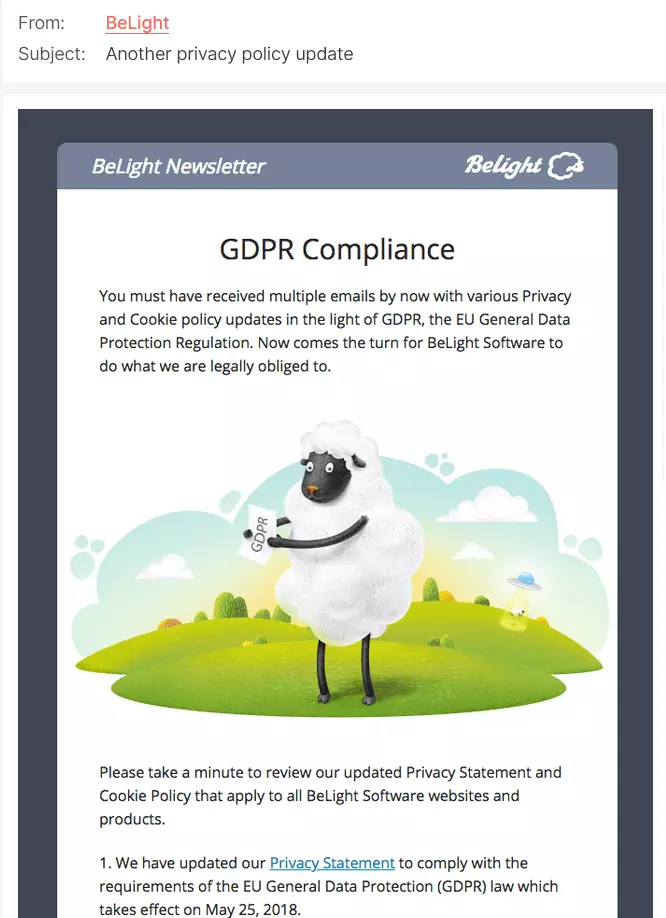
Another email trend is competing with the possibilities of artificial intelligence and shouldn’t be ignored: data protection. This, of course, isn’t a new topic. Data protection is, was, and will continue to be an important task for marketing specialists. The large amount of personal information makes it easier to advertise on the internet (especially in combination with AI). You need to comply with the laws, however. If you fail to do this, your (future) customers will lose faith in you.
While there is no federal data protection law in the US, there are some state laws that you can consult, such as the California Consumer Privacy Act (CCPA). If you’re sending newsletters to customers within the UK or the European Union (EU), you’ll have to comply with the General Data Protection Regulation (GDPR). The GDPR has outlined strict rules for how companies handle personal data. Although the UK is no longer part of the EU, it’s “UK GRPR” is quite similar to the EU GDPR.
Find out more about data protection in Europe in our extensive article on the GDPR in the EU. Although it is an EU regulation, it could affect your website and newsletters in the USA and elsewhere, too.
Customers must agree to their data being collected and it may only be used for purposes to which they’ve given their consent. In other words, data provided by a customer so they can buy something cannot be then used for advertising purposes. This requires additional approval. You must also ensure that this data does not fall into the hands of unauthorized people.
Furthermore, there are extensive documentation and information obligations relating to which data you store for which purposes. You must also provide the user with information about how data will be stored as well as delete all or any data at the user’s request. Another important point for many companies is the one best known as “privacy by default”: the technical setting for the collection of personal data must always be as restrictive as possible. Personal data may only be transmitted after users have given their explicit consent. For email marketing, this means that in the future you will have to handle user data even more transparently and responsibly than was required in the past.
New KPIs
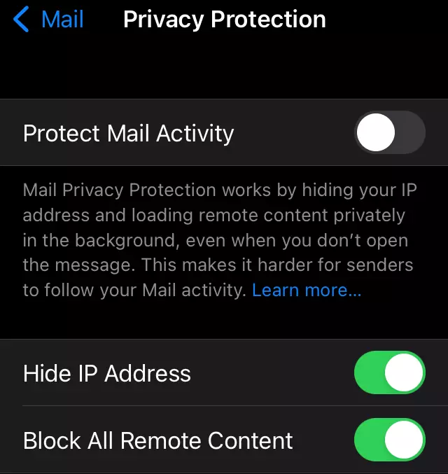
Software manufacturers are increasingly working to strengthen the data protection of their users. Apple, for example, has built a feature into its in-house mail client called Mail Privacy Protection, which makes it impossible to track the opening rate of emails. Since the iPhone is one of the most popular devices for receiving emails, it may be unwelcome news for marketers, but many see this as an opportunity. Further data is required to determine the success of a newsletter campaign in the future.
Therefore, you should focus on the click-through rate. Although you want your newsletter to inform readers and clients (which is where open rates come in), you also want to redirect readers to your website. If users click through to your website, your newsletter has been a success. The conversion rate is another strong indicator of successful email marketing — the more newsletter recipients make a purchase, the more successful the email has been.
If you prefer to continue working with open rates, you should exclude Apple devices from your analyses so as not to distort your analytics data.
The email marketing trends of 2025 are bolder than ever before. Automation, individualization and data protection will continue to be important in the future and can be developed further by adding artificial intelligence to the mix.
It’s also becoming apparent that the content of newsletters is once again coming into focus: customers are less and less likely to be convinced by pure superficiality. Instead, you should convince them with fascinating stories and convey the values of your company. To score points in the area of authenticity, add user-generated content to your newsletter. This applies to the newsletter as well as content on all other channels, as a unified omnichannel marketing strategy becomes increasingly important.
Some ideas for successful newsletters in 2025
Throughout the year, you’ll have plenty of opportunities to make your email marketing seasonal to increase customer engagement. So that you don’t break a sweat and can plan your successful campaigns in advance, we have put together a list of a few important dates for you to consider:
| Date | Event for newsletter campaigns 2025 |
| January 1 | New Year: Wish your customers a good start to the new year. |
| February 12 | Super Bowl: The American football game is gaining traction internationally, too. |
| February 14 | Valentine’s Day: Romantic themes work best every year around Valentine’s Day. |
| March 8 | International Women’s Day: Reaching out to the women who subscribe to your newsletter is always welcome! |
| March 20 | Start of spring: With the flowers starting to blossom outside, it’s the ideal opportunity to introduce new colors and ideas into your mail-outs. |
| April 7 – April 10 | Easter: The Easter holidays are a time to address families. |
| May 14 | Mother’s Day: There are all kinds of ways of showing appreciation for moms, not just presents, so be creative in your letters! |
| June 18 | Father’s Day: An opportunity to highlight dads across the USA! |
| October 9 | Thanksgiving Canada: Time to give thanks and show your readers, Canadian or otherwise, that you are grateful for their readership. |
| October 31 | Halloween: The festival of horrors is becoming more and more popular around the world. |
| November 23 | Thanksgiving USA: A second opportunity to give thanks and again show your readers that you are grateful for their readership. |
| November 24 | Black Friday: Black Friday is getting bigger each year, either join in with the madness, or acknowledge it with alternative offerings. |
| November 27 | Cyber Monday: Cyber Monday might give you an opportunity to reach out to begin the Christmas period. |
| December 25 | Christmas: Christmas campaigns can be easily spread via newsletters. |
| December 31 | New Year’s Eve: The end of the year is the perfect moment to look back. Make sure to share it with your customers. |
- Fast drag and drop editing
- Simple personalization
- AI-powered text generation


