What is a one pager and how are they created?
As the online storefront of a company, a website is the first stop for potential customers looking for information and offers. Depending on the industry, a certain level of innovation in the design may be required to grab attention. For those who want a change from conventional website design, a one-page design could be the answer.
One pager, the web design trend
Websites are usually built in a similar way to traditional print media. When searching for information and content, the user jumps from page to page. In the same way that you might “flick” through a magazine, users “click” through your website via the navigation tools provided. One-page web design, also known as single-page design or pageless design, breaks away from a typical structure that sees users click from page to page, opting instead for a different structure. A one pager is a single page. All the relevant information that would normally be displayed across several different subpages is presented as part of this single page, allowing users access to all the important content without all the clicking. This simple navigation is achieved through an intuitive, user-friendly concept.
How to create a one pager
To take advantage of one-page design, you need a well thought-out concept for the page. Should it be a classic company page with contact options? Or maybe you want to create a landing page specifically for lead generation? Or maybe a page for a product, event or specific topic?
Before you put your plan into action, you should first choose and register a suitable domain. You also need to decide how to create your one pager and find a suitable hosting environment.
How to find a suitable domain for a one pager
Having a good idea for what to include on your one pager is only half the battle. It is just as important to register a meaningful web address. This should fit as well as possible to you or your content. You can use a domain checker to find a good combination for a domain name and top-level domain.
Website builder kit: CMS or web design service for programming a one pager?
Compared to a complex website with various subpages, a one pager requires significantly less programming effort. However, the task shouldn’t be underestimated. Consider whether you want to design the one pager yourself, with the help of a website builder or content management system, or whether you would rather leave the programming to a professional agency or web design service. It is important to weigh the effort and costs to see which option makes most sense. Don’t forget to take your own expertise into account so you have a satisfactory solution ready in the end.
Get started today with the intuitive Website Builder from IONOS and create your own one pager using high-quality templates!
Create suitable hosting structures
You need a suitable hosting environment so that your one pager can be accessed via the internet at the desired web address. You can technically host the site on your own because the one-page design takes up significantly fewer resources compared to more complex website structures. However, to be on the safe side in terms of availability and performance, it might be better to use a professional hosting service to host your one pager.
The main elements and tips for one-page design
A one pager ideally leads visitors in one direction i.e. directly towards conversion. This is why there is almost always a corresponding CTA (Call-to-Action) at the bottom of the page, which prompts users to purchase, register, order, participate or carry out some type of action. In order to lead users in the desired direction, the content must be prepared well and structured accordingly. Typical elements and stylistic devices include the following:
- Storytelling: If you want to win over your visitors, you have to tell a story. One pagers offer an excellent opportunity to tell the story of a product, an application or a campaign. The goal is to create a special user experience through text and multimedia content that does not interrupt the reading flow.
- Fixed navigation bar: A fixed navigation bar can be found on most one pagers. Here the navigation always remains fixed on the screen so you can jump to another element on the page at any time.
- Jump markers: Use jump markers or other call-to-actions to give users the option of jumping to different places on the page.
- Scrollspy: With a scrollspy plugin, the user always knows which part of the website they are viewing.
- Interactive infographics: One pagers provide a great way to work with animations and interactive infographics. A good example is the following graphic that displays the most popular names for a particular breed of dog.- Parallax scrolling: Unlike traditional scrolling features, individual elements and levels of the website move at different speeds with parallax scrolling. By using this technique, a website’s depth can be increased. Flat design: It’s also common to use flat design in combination with one-page design. This refers to deliberately refraining from shadows, three-dimensional elements and other realistic textures. A flat design is intended to reinforce the reduced, minimalistic character of one-page layouts by focusing on limited content in its simplicity and structure.
Is one-page design right for me (with examples)?
A simple one-page structure offers many advantages, but it’s certainly not suitable for every type of website. The first decisive factor here is content. If you want to offer your visitors lots of information, perhaps even broken down into different categories, a one pager isn’t a suitable choice. If, for example, you wanted to create a news portal, it would be very difficult to do so using one-page web design. But the amount of information isn’t the only thing to consider when it comes to one-page design. The intention of the website is also a crucial factor. One pagers are especially good for one particular thing and that is sales. If the information is organized in a sensible way, potential customers don’t have to search to find important information because they have all the relevant information right there in front of them.
Business with clear offers and services
One pagers are an excellent alternative design option for companies with a manageable portfolio of services and/or products. A good example is the website of the American software developer Dolox.

Agencies
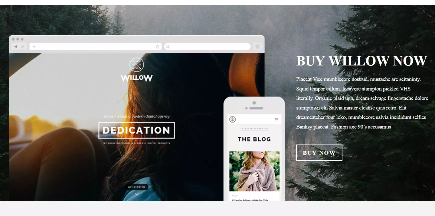
One-page design is especially suited to agencies as the website of the web agency Willow proves.

Personal profiles (portfolios)
A one pager also gives individuals and freelancers the opportunity to briefly introduce themselves. The portfolio page of copywriter Charlie Pite demonstrates how to successfully capture the attention of website visitors with just one page.

Presentation of projects or campaigns
Individual projects or campaigns can also be presented on a one pager. An impressive example can be found on the National Domestic Workers Alliance’s one-page website, which addresses the disdain for domestic helpers in the USA and promotes the Oscar-winning film “Roma” about the housekeeper Cleo.

Events
Whether it’s for a business, public institution or private individual, an upcoming event can be promoted with a one pager, as seen here for Jess and Russ’ wedding.

Advantages and disadvantages of one pagers
In the right context, with the right content and the right strategy, a single-page website offers a number of advantages. Of course, this unusual design also has a few disadvantages that cannot just be brushed under the carpet. The following table summarizes the most important arguments for and against single-page design.
| One pager advantages | One pager disadvantages |
|---|---|
| Simple, clear design | Usual navigation routine is interrupted |
| Intuitive, simple operation | Comprehensive content and keyword strategies impossible |
| Good storytelling thanks to how content is laid out | Frequently long loading times due to all the content appearing on one page |
| Users can be led specifically to conversion |

