What is responsive navigation? Dynamic menus for mobile browsing
Responsive navigation is a key aspect of mobile optimization. If mobile navigation doesn’t guide users smoothly from point A to point B, they’re likely to leave the page quickly—resulting in lost traffic and, more importantly, lost revenue. Various concepts like slidedown menus or bottom navigation bars can help improve the website navigation experience.
What makes a good responsive navigation?
A good navigation system is the backbone of any website—it helps users find the information that matters to them. Navigation elements should work smoothly, have a clear and self-explanatory structure, and allow for intuitive use. The main challenges of responsive navigation lie in limited screen space and touch-based interaction on mobile devices. Still, there are several responsive solutions that ensure a clean and user-friendly website navigation experience.
The core idea behind responsive web design is that a page’s content and layout dynamically adapt to the device’s conditions and screen size.
In most cases, it’s best to follow the “mobile first” approach. This design strategy prioritizes the mobile optimization of web projects—putting the mobile version’s design, usability, and performance first, before adapting it to desktops and laptops. Retrofitting an existing website navigation system for mobile use is often more complicated and time-consuming. That’s why, before starting to plan and build your responsive navigation, you should answer a few key questions—especially regarding the placement and overall structure of the navigation.
An accessible website is more important than ever—and navigation plays a key role in this, including screen reader compatibility, sufficient contrast, and other accessibility features.
Where should the navigation be placed?
Common approaches to navigation placement include footer navigation and placing the menu at the top of the page. With footer navigation, users only see a link to the navigation at the beginning of the mobile page, which takes them directly to the footer where the individual menu items are located.
Footer-based navigation, however, is not very user-friendly: users expect important navigation elements to be easily accessible, which is why footer navigation is becoming less common. Today, mobile navigation is more often placed at the top of the page. This classic approach to responsive design is familiar to most users.
How is the navigation structured?
There are various possibilities when it comes to structuring your navigation. Two of the most popular options are list navigation and responsive grids.
Lists can be displayed as both a single-level and a multilevel navigation. There are two clear advantages of this format: firstly, web developers can implement lists relatively simply, and in addition, it accommodates the user’s habits.
A grid navigation is ideal for short navigation items and is especially popular in ecommerce. Items are displayed side by side in a grid layout, with the number of columns depending on the screen size. If you’re planning a two-column grid, make sure the number of items is even to avoid an asymmetrical layout.

With both variations, it’s possible to add further sub-sections, which can fade in and out.
What mobile navigation concepts are available?
Now we come to the central question: how should the mobile navigation menu open? The concept is determined by the way in which the navigation is presented to the user. The display options are diverse: the navigation can be displayed directly on the page or opened by tapping a link. The navigation can either move the content down or lie above it. Here we’ve collected some examples.
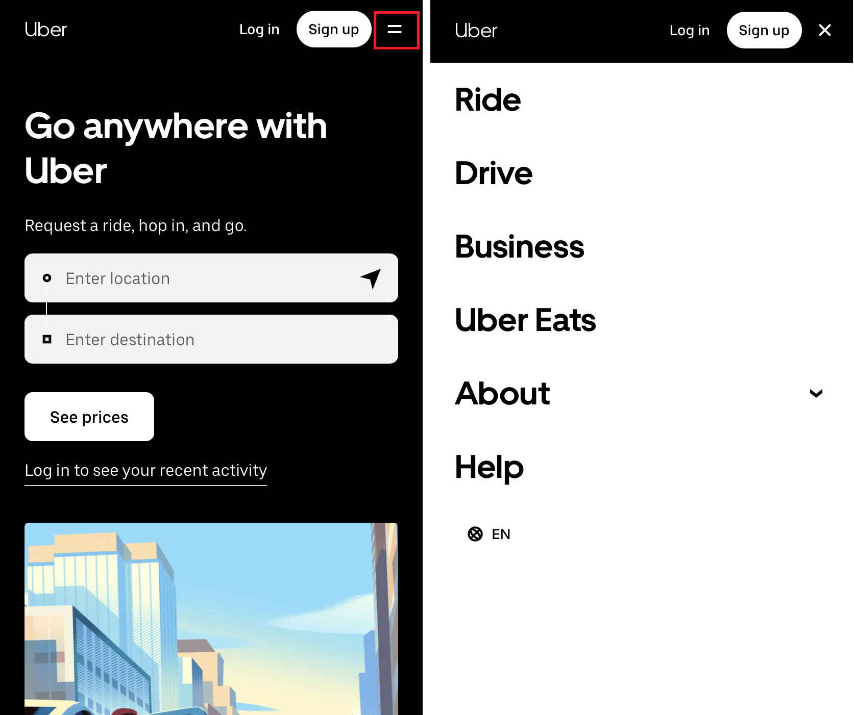
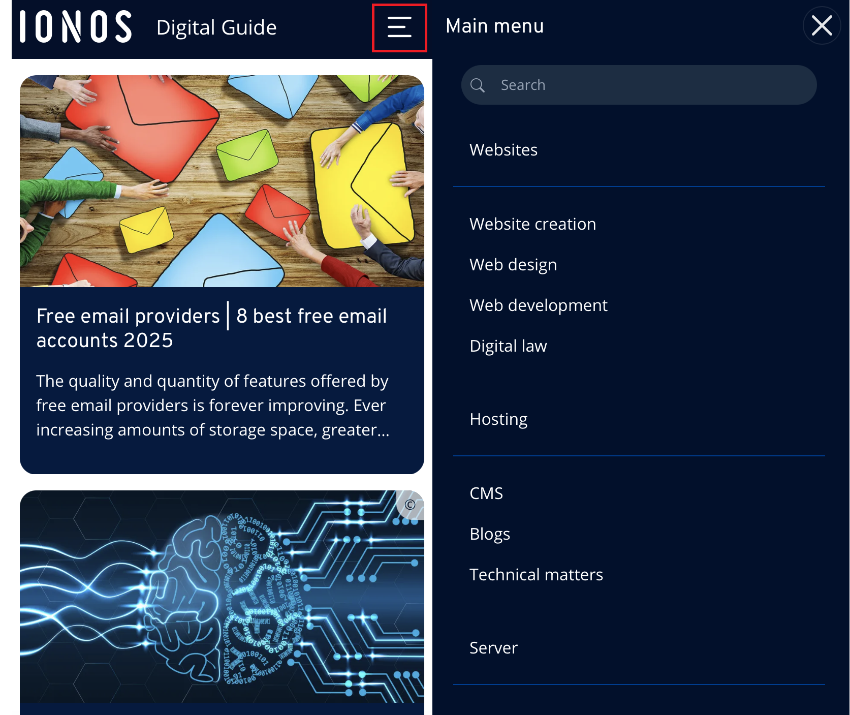
No matter which navigation concept you choose, the hamburger icon has become the standard for opening menus on mobile devices. The small symbol with three horizontal lines is now widely recognized on smartphones and tablets as the universal sign for a hidden menu.
Navigation via drop-down menu
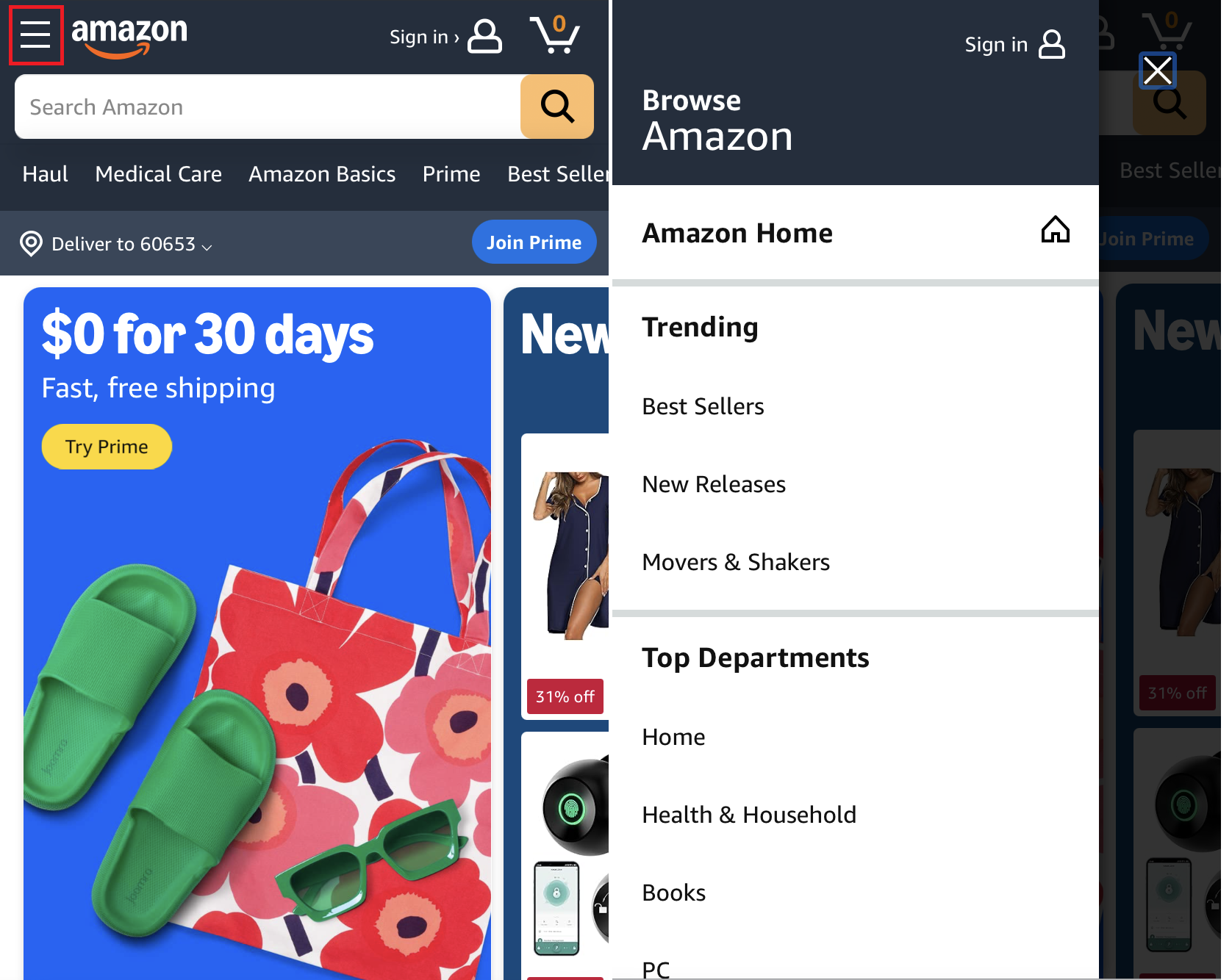
One of the classic responsive navigation types is the dropdown menu. It closely resembles traditional desktop navigation, making it familiar to users and a commonly chosen navigation concept. The menu is activated by pressing a button or icon and appears over the content without fully covering it.
Slidedown navigation
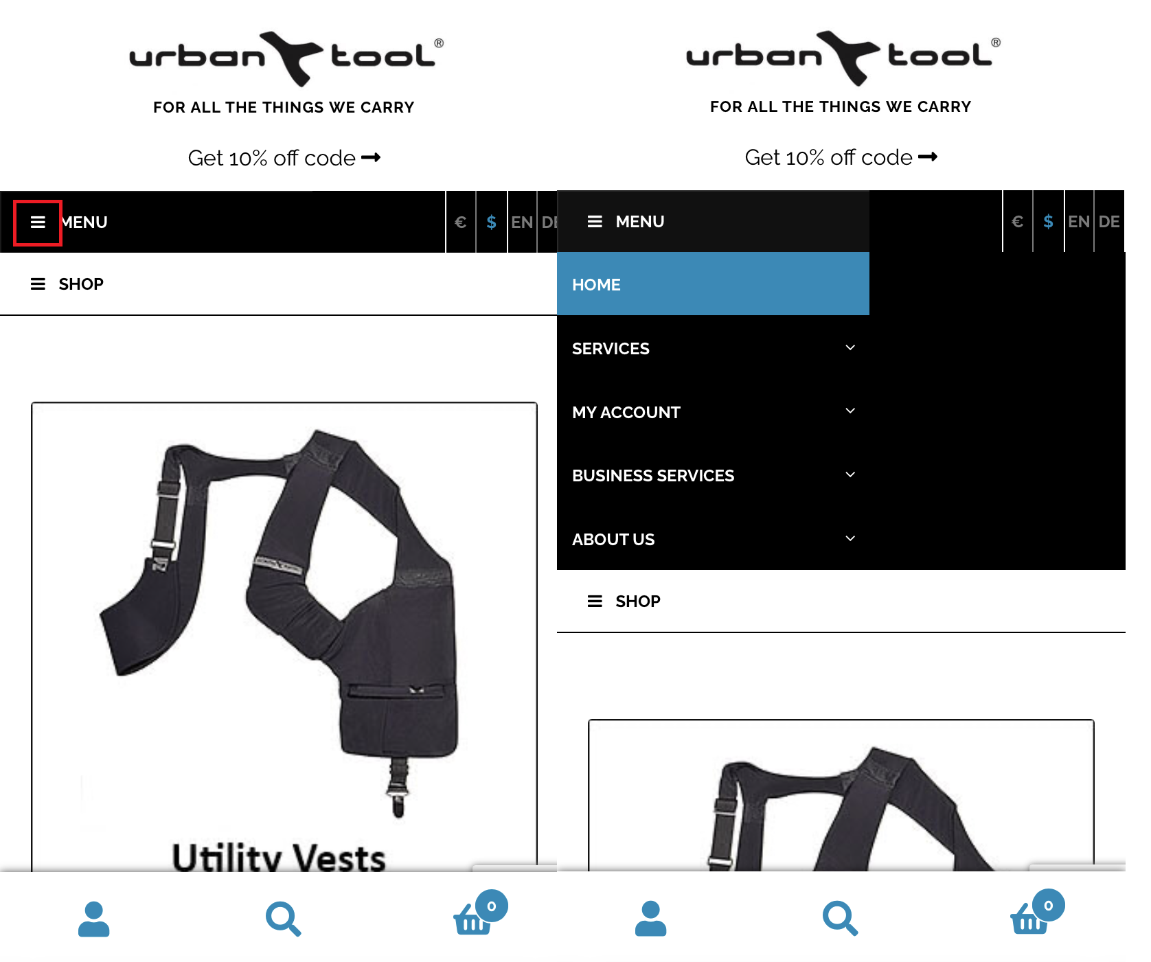
Another popular type of navigation is the slidedown menu, also known as accordion or expandable box navigation. When users tap the menu button, the navigation slides open—unlike dropdown menus, it doesn’t overlay the content but pushes it downward instead. While slightly more complex to implement, this approach is considered highly scalable and space-saving. Thanks to its ability to include sub-navigation items, it offers an elegant solution for both simple and more complex menus.
Bottom navigation bar
The bottom navigation bar is an increasingly popular solution for mobile apps and websites, where the menu is displayed at the bottom of the screen. This navigation style is especially user-friendly, as it’s easy to reach on smartphones. It works well for projects with a few key navigation items and provides a clear, organized structure that helps users quickly switch between the main sections of the website.

Off-canvas navigation
In this approach, the responsive navigation is placed outside the visible area of the screen by default. The menu isn’t integrated into the main layout, which makes off-canvas navigation a space-saving solution that doesn’t take up any room in the viewport. Only when the menu icon is tapped does the navigation slide into view, pushing the entire layout aside. This method is particularly well suited for large navigation hierarchies with multiple submenus.
