Responsive Test: 6 free tools for responsive web design
Most web designers are aware of the concept of responsively designed websites and the advantages associated with designing such sites. When it’s clear that it’s your aim to set up your internet presence with a responsive design approach, then it’s important to test the site’s appearance on various devices during the development process. At the latest during the test phase, the web project should be checked for mistakes and other inconsistencies by executing a ‘responsive check’: by using different devices, users are able to preview how their site’s layout looks and reacts to various devices and/or resolutions. In order to make the most of such tests, it’ best to look out for, and use, certain tools — we’ll show you 6 of the best free-of-charge options currently available
- Simple registration
- Premium TLDs at great prices
- 24/7 personal consultant included
- Free privacy protection for eligible domains
In-browser responsive design tests
The following tools all run within the browser itself and can be used free of charge without any need of registration. All applications in this text come in the form of simple, easy-to-use web apps: all you need to do is enter the URL of the web project you want to test, and before you know it, you’ll be presented with different depictions of your website in varying screen sizes. During this process, the responsive test tool simulates the website’s display within a certain resolution. And, as if you’re site has already gone live, users are then able to click through the test version of their web project.
Mozilla Firefox Tool
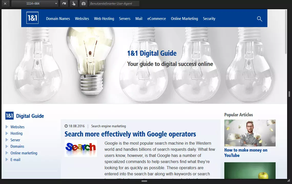
For Firefox users, running a responsive design test is easy to do: in the Web Developer submenu, select ‘Responsive Design View’. Immediately after selecting this option, the site you’re visiting will be displayed on a black background within a scalable window. At this point, users are able to adjust the site’s resolution by pulling the picture with the mouse in order to increase or decrease its size. Default resolutions can also be chosen from; these allow users to adjust the display so that it appears in a landscape or portrait format.
responsivepx
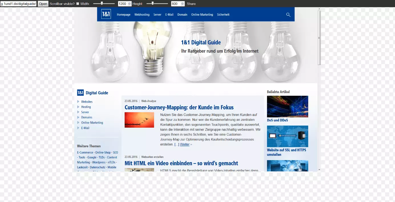
This tool offers a similar selection of resolutions to choose from as those found on Screenfly. Responsivepx enables users to expand the height and width of its virtual screen by a maximum of 3,000 pixels.
Screencheck by Cyber Crab
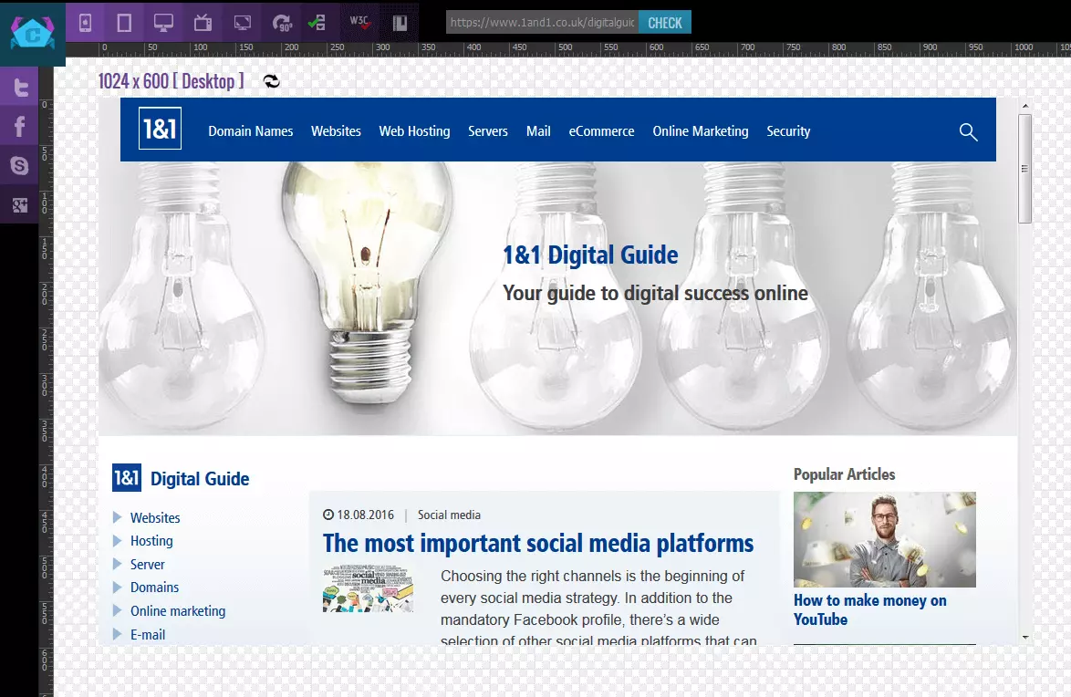
A further, well-rounded web application for responsive design that’s set-up in a similar fashion to the two preceding options is Screencheck by Cyber Crab. The application can be used directly on the provider’s website.
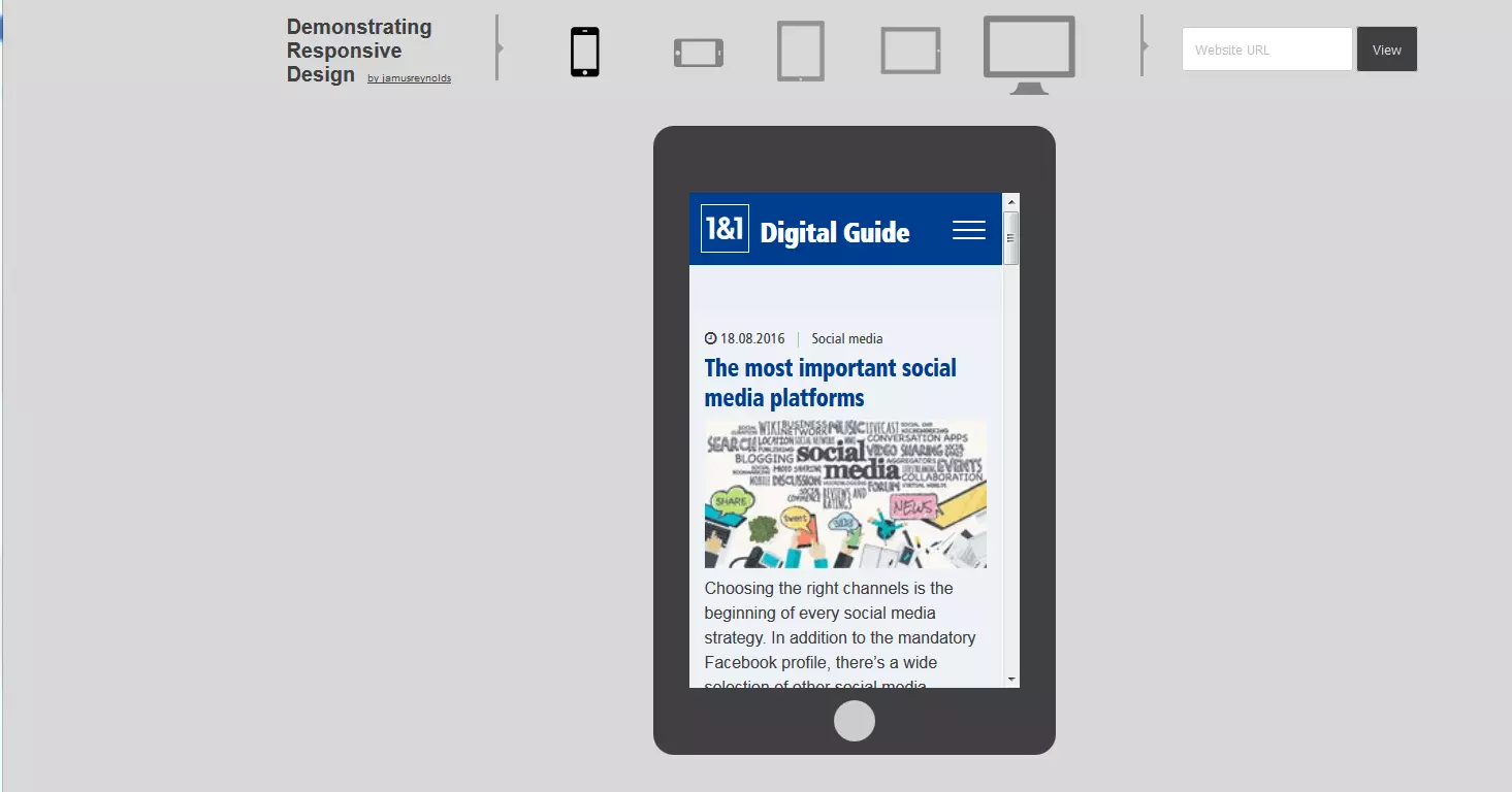
Demonstrating Responsive Design
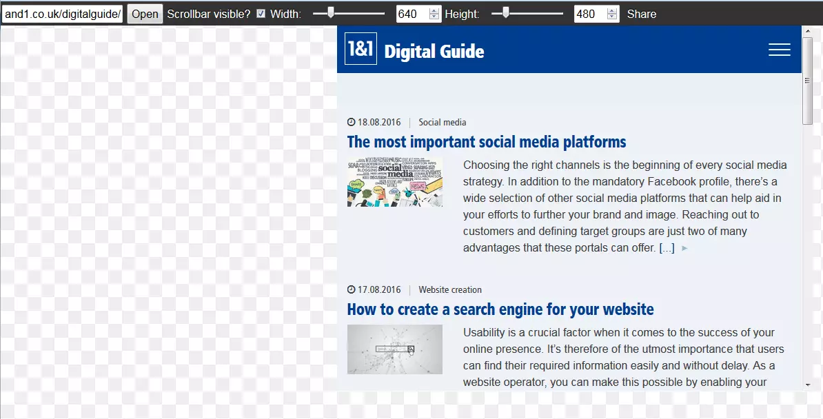
Demonstrating responsive design has only three different screen sizes on offer (smartphone and tablet varieties can also be found in landscape format). This lack of variety is somewhat compensated for due to the ease with which users are able to switch between the different individual display forms.
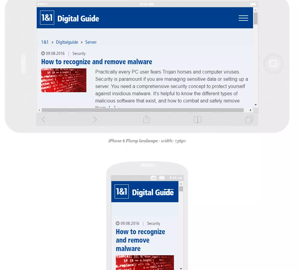
Responsinator
Responsinator simulates websites on a total of six different mobile devices, each in both possible display formats (see image). Different versions of popular products, like iPhones, Android smartphones, and the iPad are available for testing.
Am I Responsive?
The website, Am I responsive provides users with four different apple devices for testing their website: desktop (resolution: 1.600 x 992 Pixel), laptop (1.280 x 802 Pixel), tablet (768 x 1.024 Pixel) and mobile (320 x 480 Pixel). One of the application’s advantages is that allows different sizes to be directly compared.
While the applications are indeed useful for testing various responsive design aspects for your site, users are advised to seek other means, such as actual devices, for testing their web projects. After all, the sites listed above only simulate how a website is displayed. Actually running it on physical devices is a whole new ball game.
Some content simply cannot be displayed by using responsive design tools: for example, the way in which different high-performance devices, various browsers, or multi-touch screen control effects a website’s user experience. What’s more, the display of a website may be partly distorted when such tools are used. Scrollbars may appear during a responsive-design test, a feature that doesn’t exist for mobile devices with touch screen navigation.
Despite this, online tools prove to be valuable components for comprehensive responsive tests. Web designers especially benefit from the uncomplicated and quick modification of the content’s resolution; a feature that immensely accelerates the testing process.


