How to change WordPress fonts
There are several ways to change the fonts in WordPress. On the one hand, it is possible to format text blocks or individual sections in the editor. This is easy, but soon leads to an inconsistent appearance in the long run.
It is better to define fonts for the entire site in the theme. This way, a consistent and appealing design is maintained. However, you need admin rights and a bit of expertise to make the changes. We will show you how to change WordPress fonts best.
- Simple registration
- Premium TLDs at great prices
- 24/7 personal consultant included
- Free privacy protection for eligible domains
Changing the fonts in WordPress
Let’s consider the simplest case of changing the font for an existing WordPress website. Normally, the theme sets a font for all the text. Let’s assume it is a generic sans-serif specification. Now we want to change the headings to a serif font. In WordPress, this requires two steps:
- Define font for HTML elements in CSS
- Include CSS code in WordPress
To define the font for an HTML element, we use the CSS property “font-family”. The related “@font-face” is used to define custom fonts.
| CSS specification | Explanation | Example |
|---|---|---|
| font-family | Set font | body { font-family: 'my-custom-font', sans-serif; } |
| @font-face | Define custom font | @font-face { font-family: 'my-custom-font'; src: local('my-custom-font.woff2'; } |
Among the wide range of devices used to display web content, there are a small set of practical Websafe Fonts. These work almost everywhere; however, there are slight differences in appearance. To iron these out, you can use so-called CSS font stacks. These are groupings of similar-looking fonts from which the browser selects the first available one.
How do you specify a font for an HTML element in CSS?
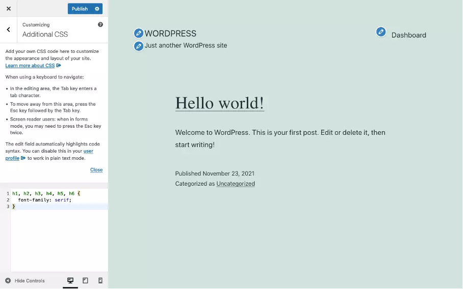
First, let’s look at how to set the font for an HTML element in CSS. For our example, we want to use a serif font for the H1 to H6 headings. We use the following code:
h1, h2, h3, h4, h5, h6 {
    font-family: serif;
}
How to include additional CSS in WordPress?
There are different methods to integrate additional CSS into WordPress. Which exactly is used depends on how the theme is built. Commercial themes and page builders often offer a custom setting to include additional CSS. We’ll show two common methods that work with most standards-compliant themes:
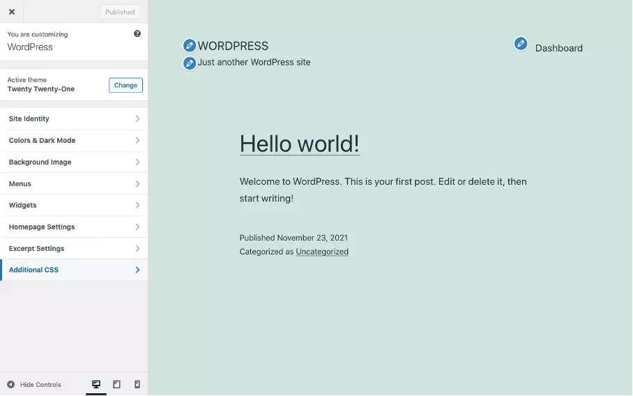
- Using the WordPress Customizer to include additional CSS; illustrated with screenshots.
- Including additional CSS via the functions.php file, ideally in a child theme; the specific procedure is described in our tutorial on editing a WordPress header.
The following WordPress articles are helpful to change the font in WordPress:
How to add another font in WordPress?
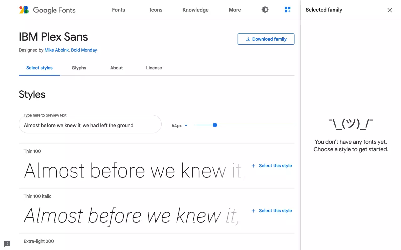
To add a font to a website a webfont is needed. This can be obtained directly from Google Fonts or a similar platform. To do this, it is sufficient to include an additional stylesheet hosted by Google in WordPress. However, there may be privacy concerns with this. Depending on the method used to embed the web font, site performance may be affected. It is therefore usually preferable to host web fonts as part of the theme folder on the WordPress server.
Webfonts are included in a website that requires a special stylesheet in addition to the font files. Platforms like Google Fonts offer stylesheets and font files for download as well as embedding into websites. This is convenient, but optimal use requires background knowledge and a specific approach. This is because each additional font is downloaded by the browser and “costs” accordingly.
How to self-host a web font as part of WordPress?
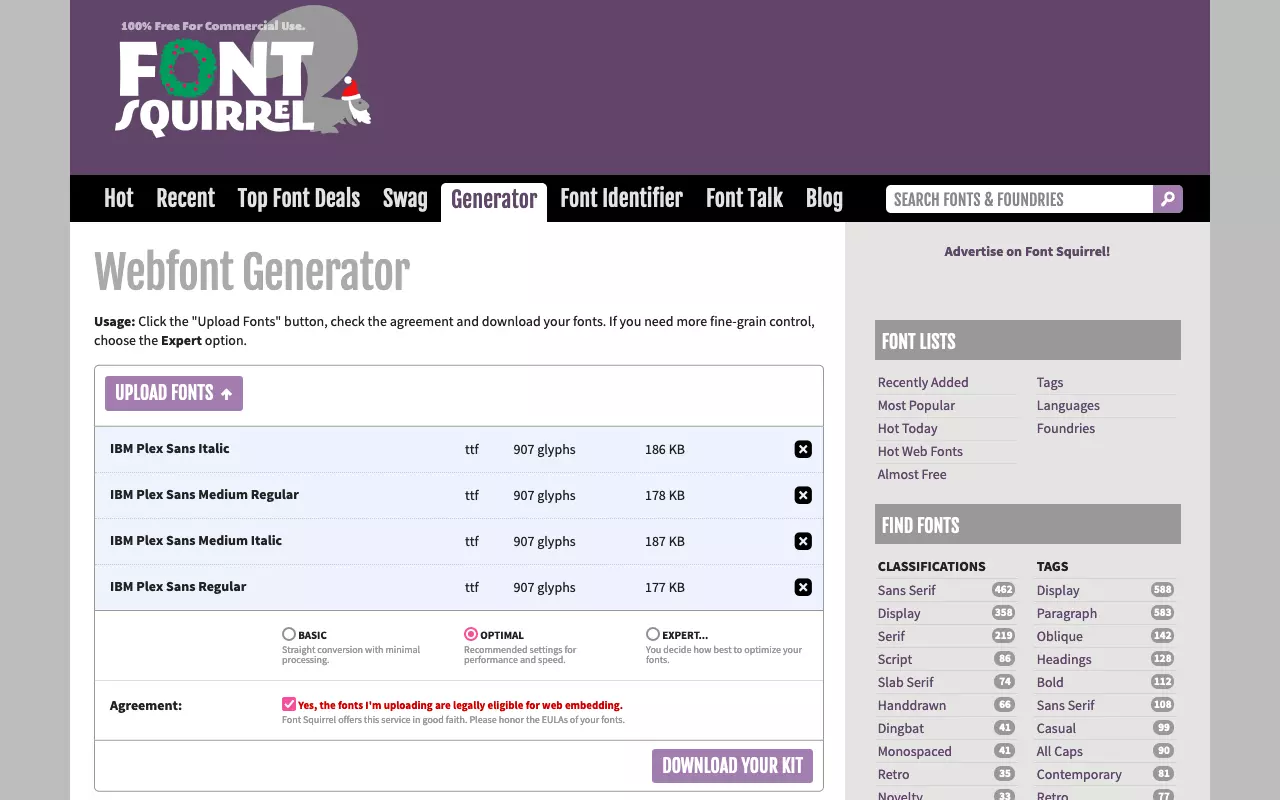
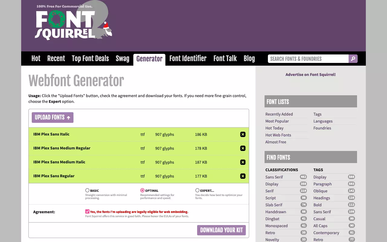
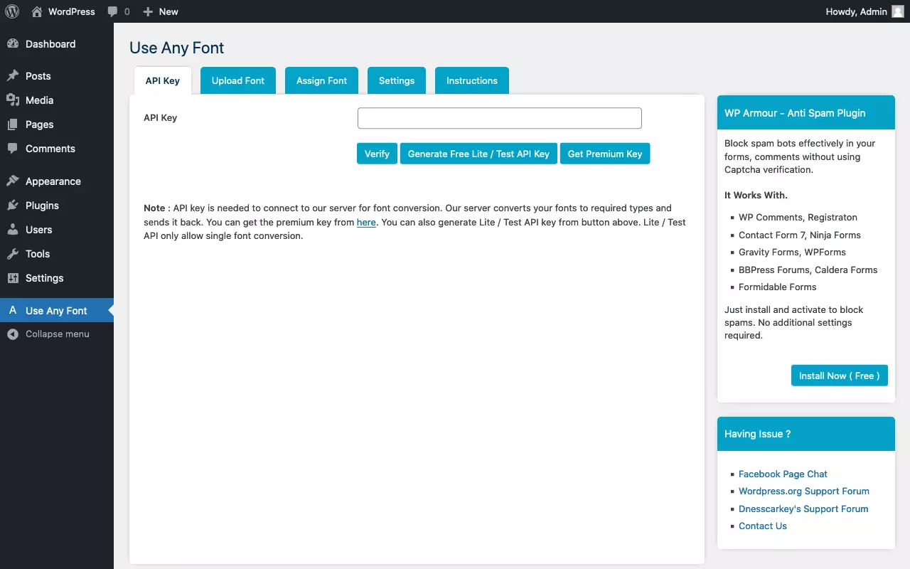
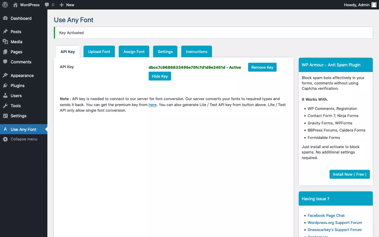
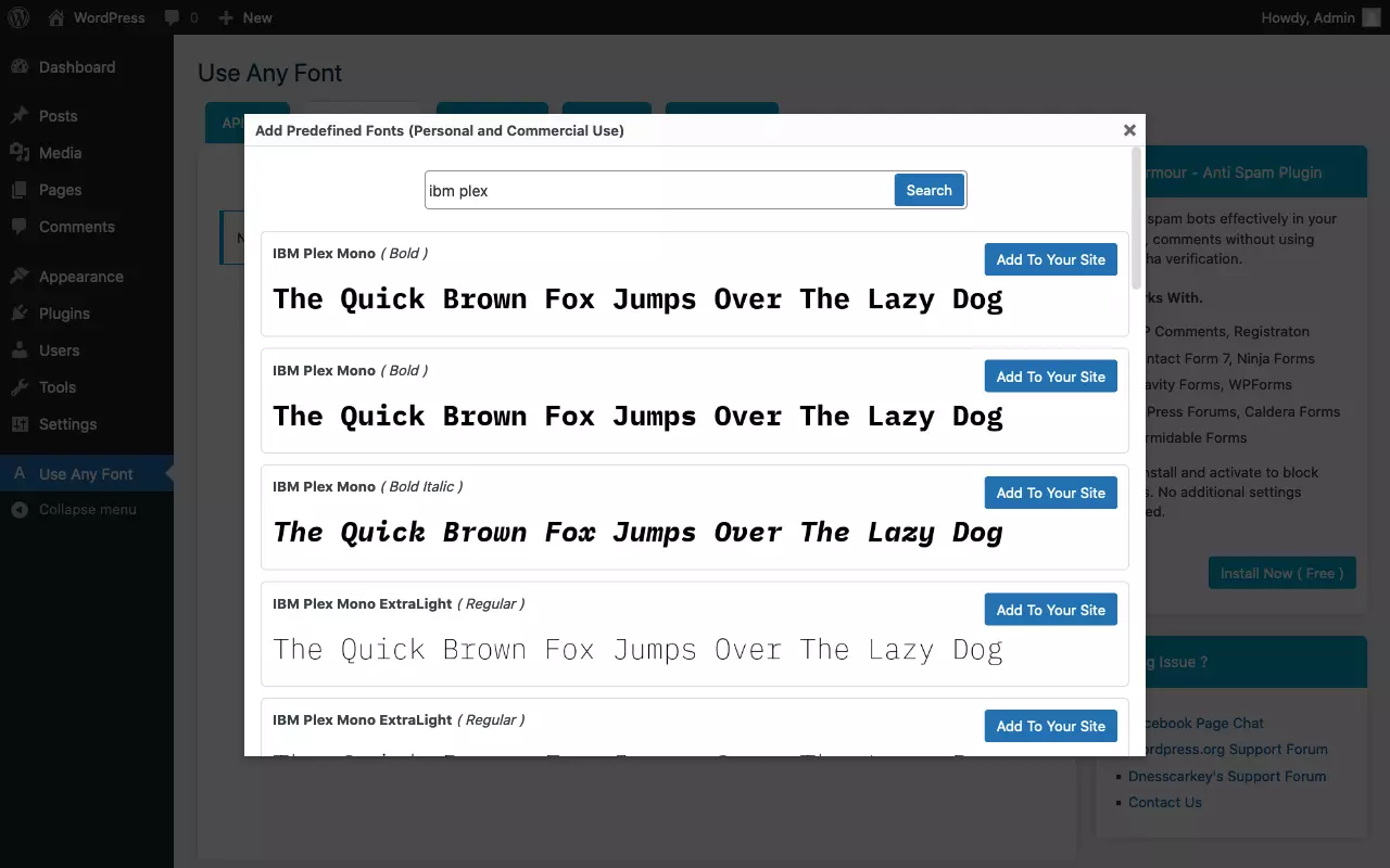
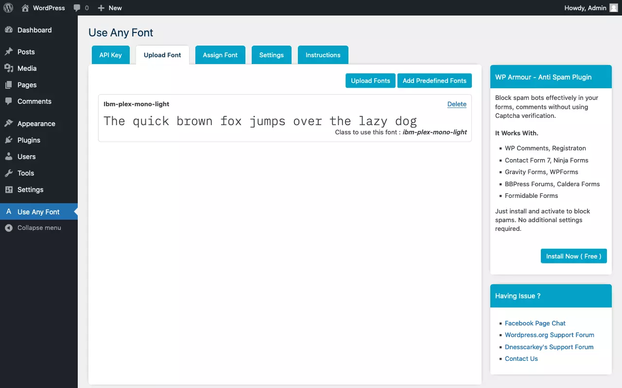
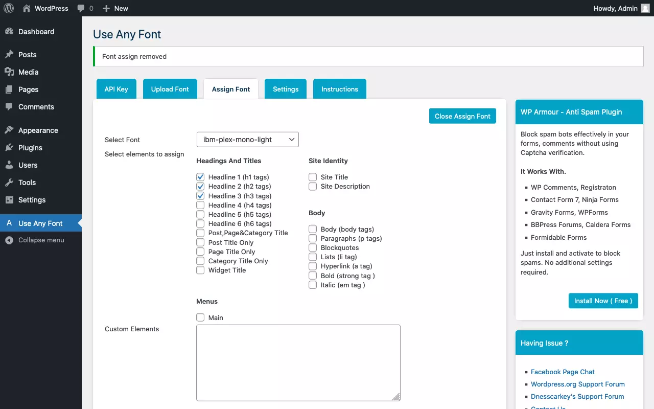
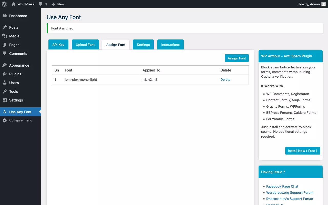
Hosting web fonts yourself is easier said than done. The best way is to use a specialized tool that generates all common web font formats from uploaded font files, including the necessary CSS code. Over the years Font Squirrel has established itself as the standard. Alternatively, you can use a plugin like Use Any Font to add a font to WordPress.
Font Squirrel
Use Any Font
What is Icon Fonts all about?
Besides web fonts for displaying text, there are the popular icon fonts. The glyphs of a font do not have to represent letters. The vectors they contain are simply mathematically defined shapes. This way, you can also display icons that are often used for social media, for example.
Caution: Icon Fonts are not to be confused with a website’s time-honored Favicon.
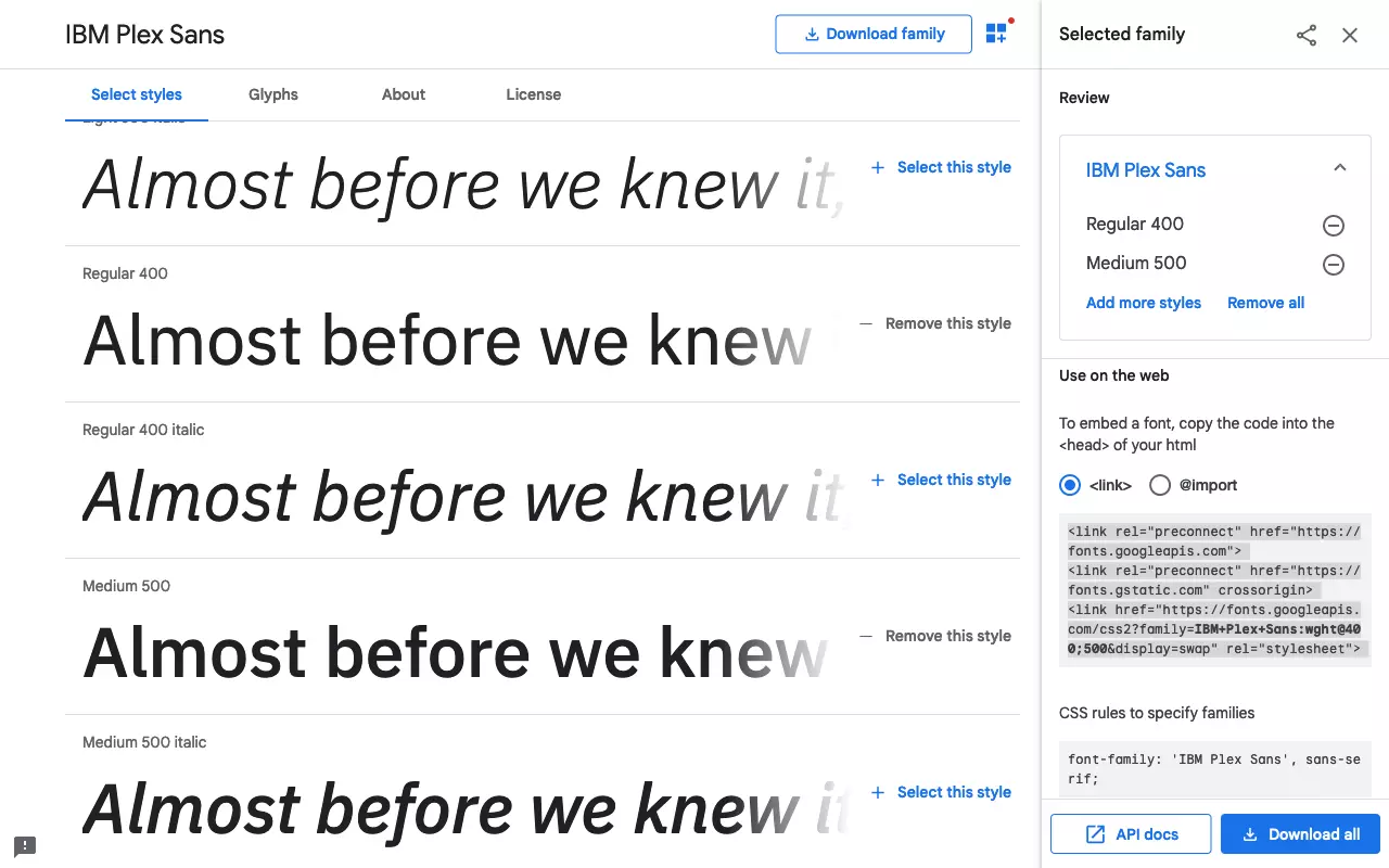
How to use a web font from Google Fonts in WordPress?
In most cases, it is preferable to host web fonts yourself. However, there are exceptions. Perhaps it’s just a matter of trying out a new font on a staging site. Or the site in question is a small blog where performance is not so important. So we show the required procedure here for the sake of completeness.
To add a font from Google Fonts to WordPress, follow these steps:
- Select the desired font from Google Fonts: Use the search and filter function or go by your own eye.
- Select individual style variants: Keep in mind that each additional style variant will cause you to download another font file.
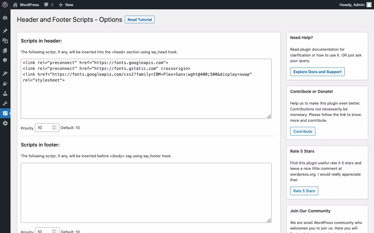
- Place stylesheet code in WordPress header — as explained in our tutorial on how to edit a WordPress header.
- Set font via CSS — either for the whole site or for individual elements.
- Create & customize your site with AI tools made for everyone
- 3x faster: SSD, caching & more
- Daily security scans, DDoS protection & 99.98% uptime
What methods can be used to include a web font in WordPress?
To summarize, we show common methods that can be used to add a font to WordPress. All of these have their own advantages and disadvantages:
| Embed webfont | Advantage | Disadvantage |
|---|---|---|
| Using a CSS @import statement | Simple, supported by Google Fonts; requires access to stylesheet only. | Bad for site performance; may prevent parallel loading of stylesheets. |
| Including CSS via <link rel="stylesheet">. | Simple, supported by Google Fonts; requires access to WordPress headers only; may benefit site performance if external stylesheet is retrieved from cache. | Requires access to theme or WordPress headers; may be bad for site performance as stylesheet is loaded as a separate resource. |
| Using webfont plugin | Simple; operate from WordPress dashboard; works with fonts that are not publicly hosted. | Requires installation of another plugin; less control compared to manual method and webfont generator. |
| Including CSS via wp_enqueue_style(). | Better site performance as stylesheets are minimized and concatenated. | Requires access to theme or functions.php. |
| Defining a CSS @font-face rule | Large degree of control, including FOUT fix. | Requires special knowledge. |
| Creating webfont with a generator and integrate into theme. | Works with fonts that are not publicly hosted; greatest degree of control of generated font files and @font-face rules. | Generated files must be integrated into theme and customized if necessary; requires special knowledge. |
How to customize the font in WordPress?
So far we have discussed how to change fonts in WordPress. Now let’s look at how to change font size and font color in WordPress. We are basically using the same procedure that we used to change the font in WordPress:
- Locate target element and identify selector.
- Prototype CSS rules in the web inspector
- Include CSS specifications in WordPress
Overview of the most important CSS specifications to change font size and font color in WordPress:
| CSS specification | Explanation | Example |
|---|---|---|
| font-size | Set font size | p { font-size: 1rem; } |
| font-weight | Set font-weight | strong { font-weight: bold; } |
| color | Set font color | a { color: blue; } |
How to change the font size in wordpress
Let’s consider again the simplest case: We want to change the font size of the entire site in WordPress. To do this, we use the HTML root element as a selector with a percentage for the font size. This makes it intuitive to understand how to change the size:
- “Make font 10% larger”: html { font-size: 110%; }
- “Display font 10% smaller”: html { font-size: 90%; }
Now, how do we go about adjusting the font size of certain elements? Again, let’s take the headings H1 to H6 as an example. First, let’s see how NOT to do it:
h1 { font-size: 35px; }
h2 { font-size: 28px; }
h3 { font-size: 25px; }
h4 { font-size: 21px; }
h5 { font-size: 18px; }
h6 { font-size: 15px; }
Two things go wrong here: First, pixels (“px”) are used as an absolute unit. Second, the individual font sizes are arbitrarily chosen. The latter leads to an inconsistent and choppy looking design. Unfortunately, both “anti-patterns” can be found in many — even commercial — WordPress themes. It is better to use relative units for the specification of font sizes. With the unit “rem” the size specifications refer to the HTML root element. Accordingly, a specification of “2rem” means: “twice the normal font size”.
The combination of percentage for the HTML root element and rem for all other text elements is perfect for responsive design. All you need is a handful of CSS Media Queries for different screen widths that adjust the font size of the HTML root element. All other text elements automatically scale with it, keeping their proportions among themselves:
/* Mobile-first font size */
html { font-size: 100%; }
/* 'medium' Breakpoint */
@media screen and (min-width: 30em) and (max-width: 60em) {
    html { font-size: 105%; }
}
/* 'large' Breakpoint */
@media screen and (min-width: 60em) {
    html { font-size: 110%; }
}
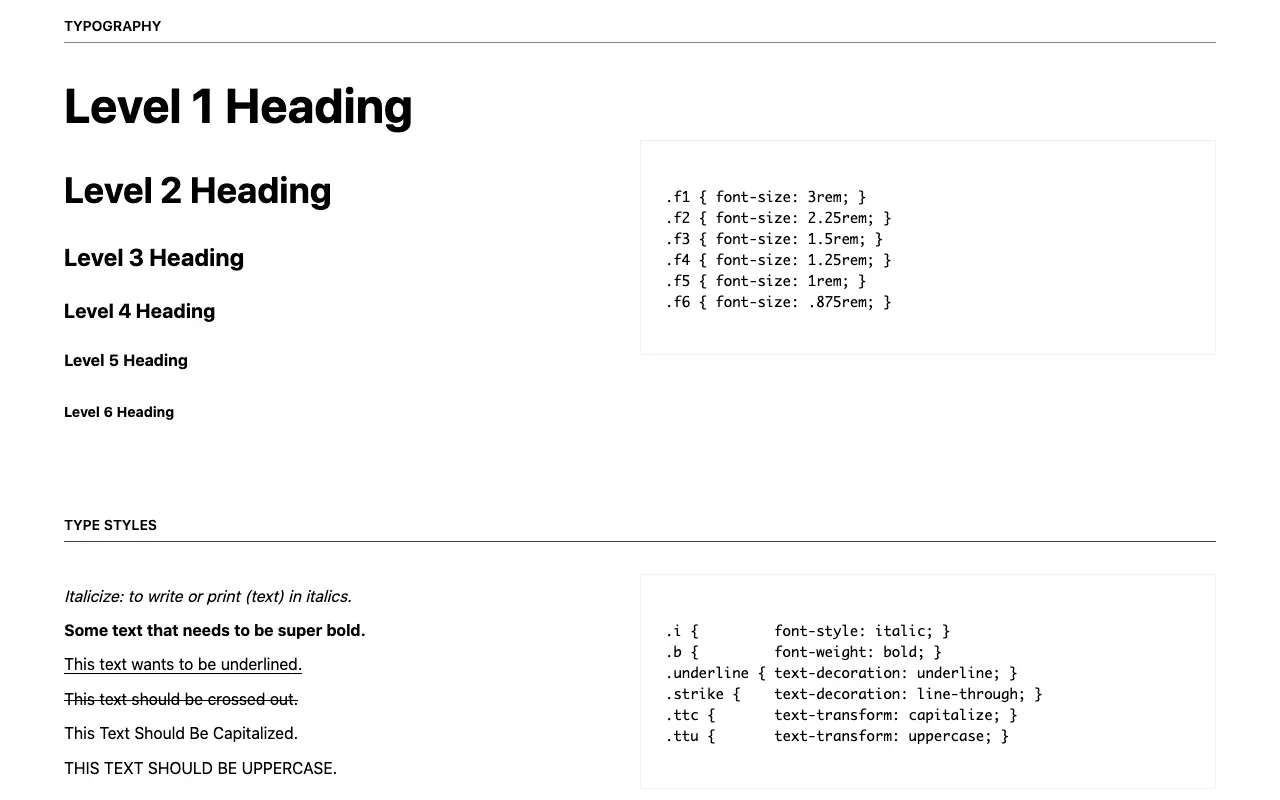
The question remains, according to what discretion one chooses the size values of the individual text elements. As mentioned above, it is not a good idea to choose arbitrary values. A good approach is to use a “typographic scale”. Typographic scales are inspired by musical harmonies and are based on mathematical formulas such as the golden ratio. Font sizes staggered according to a typographic scale exhibit a harmonious appearance. Conveniently, generators that automatically generate the required CSS code, are available online. Here we use the typographic scale of the “Tachyons” framework as an example:
h1 { font-size: 3rem; }
h2 { font-size: 2.25rem; }
h3 { font-size: 1.5rem; }
h4 { font-size: 1.25rem; }
h5 { font-size: 1rem; }
h6 { font-size: .875rem; }How to change the font color in WordPress?
Maybe you already guessed it: To change the font color in WordPress we don’t simply select all the text on a page and then pick a new color from a menu. Instead, we proceed analogously to the font and set the color via CSS code. Typical for CSS is that there are several methods to achieve a desired result. We cannot go into detail here about all the ways to define color specifications in CSS. The following CSS rules are equivalent:
body {
    color: black;
    color: #000000;
    color: #000;
    color: rgb(0, 0, 0)
}
As you can see, to set the font color for the entire site, we use the HTML body element with the CSS property “color”. All other text elements inherit from it. If necessary, we override the inherited color value for specific classes of elements. For example, to display headings in a dark gray, we make use of the following code:
h1, h2, h3, h4, h5, h6 {
    color: #555555;
}
Font color, like font type, is an essential design element. Colors convey emotions to a special extent. Therefore, it is important to stay consistent and not use too many colors on a page. An inconsistent or poorly coordinated color scheme has an unsettling effect and can downright scare away page visitors. When in doubt: Less is more.
For better usability, it is essential to ensure a sufficiently high contrast ratio. Only then will the texts be legible effortlessly. Fortunately, contrast values can be calculated for combinations of text and background color. The already mentioned Tachyons framework comes with a mature color table including some high-contrast combinations. If you copy suitable color values from there for your own WordPress site, you can’t go wrong.
Depending on the editor used, it is possible to change the font color in WordPress without using CSS. This usually quickly leads to an inconsistent appearance and is therefore not a good idea. The modern Gutenberg editor offers a viable middle ground. Gutenberg has a predefined color palette that can be adapted to the color scheme of the theme. If you assign one of the predefined text colors to a block, the editor only adds a few CSS classes. This way, the separation of topics is preserved; if necessary, the classes can be overwritten or muted afterwards.
However, Gutenberg also allows you to assign an “individual color” to individual sections of text out of the box. This should be avoided at all costs. Instead of a predefined class name, Gutenberg inserts the individual color as a hardcoded color value per inline style into the HTML code. Shown here as an example:
<span style="color:#38a300" class="has-inline-color">I live in Los Angeles, have a great dog named Jack, and I like piña coladas</span>Inline styles have the highest CSS specificity and thus stubbornly survive later redesigns. It is therefore advisable to disable custom colors in the editor. To do this, we enter the following code in the functions.php file of our child theme:
function disable_gutenberg_custom_color_picker() {
    add_theme_support( 'disable-custom-colors' );
}
add_action( 'after_setup_theme', 'disable_gutenberg_custom_color_picker' );
Alternatively, the Gutenberg colour palette can be completely disabled. Again, we use the functions.php file:
function disable_gutenberg_custom_color_palette() {
    add_theme_support( 'editor-color-palette' );
}
add_action( 'after_setup_theme', 'disable_gutenberg_custom_color_palette' );The optimal way to change fonts in WordPress is to change font settings globally via CSS. It is best to use standardized CSS font stacks. If a custom web font is needed, it is strongly advised to minimize the number of style variants. If the desired font is available as a variable font, this should be preferred. For maximum control, host the fonts yourself and use a web font generator.
If you want to change font size and font color in WordPress, the Gutenberg editor offers a good compromise. Provided that the individual font sizes and colors have been disabled via theme configuration, the predefined values can be used fairly easily.


