Using Pivot tables in Excel
Those who have to evaluate large amounts of data quickly reach their limits with conventional Excel tables – they are often too inflexible. Advanced pivot tables are the perfect solution. When it comes to evaluating and preparing data, pivot tables in Excel show their full potential: they can be used to condense data and customize the display as required on a case-by-case basis. Work that is usually difficult with conventional tables is simple with pivot tables. But how do you create such a table, and when is the format suitable?
- Store, share, and edit data easily
- Backed up and highly secure
- Sync with all devices
What is a pivot table?
Pivot tables allow users to change the display of the information without changing the data. The basis for this is always a separate, very simply designed table, which contains the complete data set. Pivot offers additional functions that allow the data to be sorted, filtered or displayed differently. An important element for understanding pivot Excel is the fact that the data can only be displayed differently. Changes to the pivot table will not create new data (e.g. duplicate data) or delete existing data (e.g. if the data is filtered) on your original spreadsheet.
What are pivot tables used for?
Let’s assume you have a large spreadsheet with lots of important data. However, not all columns are necessary for a particular evaluation. With traditional methods, you would copy all the data and create a new table. If new data is added however, you must then update several tables. Alternatively, you can build formulas that automatically move data from one table to another – this is a very tedious task and can be prone to errors. Pivot tables do the same, but with fewer clicks and without the use of formulas.
Creating a pivot table
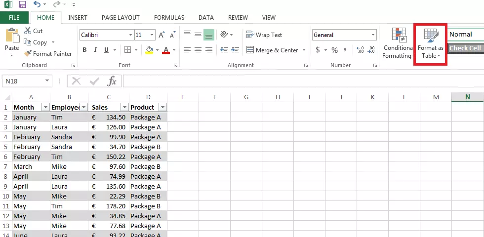
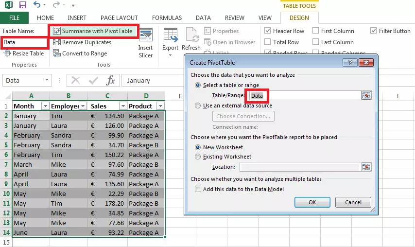
It’s not hard to create a pivot table in Excel as long as you understand how pivot works. A pivot table is always based on a set of data that consists of several columns. The first row of the column must contain the name of the respective category. The pivot table automatically retrieves its information from this. It also makes sense to format the table as such (using the “format as table” function) and assign a table name. This makes the work easier, especially with several data sets.
There are two ways to create a pivot table in Excel: you can either navigate to the PivotTable function in the “Insert” tab, or you can use the table tools. However, this is only an option if you have formatted your data set as a table. Here, you can see the function “Summarize with PivotTable”. The same window is opened this way, but the corresponding section is already selected. In the template, users can decide where the new pivot table should appear: within an existing spreadsheet or in a new one.
The data set that you want to transfer across to the pivot table does not necessarily have to be in the same working folder. The data can also be extracted from other files.
Handling pivot tables in Excel
Pivot tables provide countless functions that are extremely useful in the evaluation of data. The versatility of pivot in Excel is best described by means of an example. We’ve already created the pivot table itself; it contains a data set with a list of sales for one year. This includes the employees involved, the turnover, and the type of product sold. Note that the data set is a simple table with only the columns labeled and not the rows.
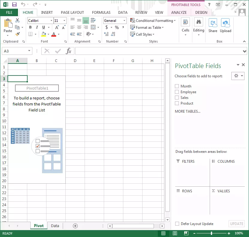
The new spreadsheet, in which data should now appear in the form of a pivot table, is completely empty at the beginning. However, the window should now have a new sidebar: the PivotTable Fields. The categories that you’ve defined for the columns of the data set should appear there. There are also four areas in the sidebar where you can drag the PivotTable Fields:
- Filters
- Columns
- Rows
- Values
By distributing the fields into the relevant areas, you are creating the actual pivot table. In general, it makes sense to define a field for the column names and one for the rows. Under “Filters”, you can specify the categories that you would like to view in the history, e.g. those you would like to view in isolation. The area of most interest is “Values”. Fields entered here become the main focus of the table.
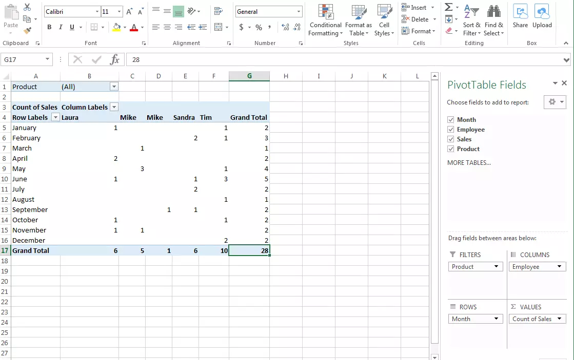
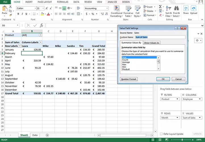
In our example, we enter the months in the rows and the employees in the columns. The pivot table automatically analyzes the information it receives from the data set and determines that twelve different months and four different employees were involved. The two product types are applied to the filters, allowing us to evaluate the table according to Package A or Package B.
Finally, our sales are reported under “Values”. Excel creates the table automatically: a table with category appropriate columns and rows is created from the original table with four columns related to the data set.
You don’t necessarily have to specify only one category per column or row. Several fields can also be dragged into the areas. It’s not possible, though, to place one category into multiple fields.
In our case, Excel automatically determines the amount of sales per month and per employee. Instead of the original monetary values, placing them under “Values” directly results in the “Count of sales”. This gives the user the option of placing the blank figures into context and then evaluating them this way: Laura made two sales in April. The pivot table also displays the overall results automatically: there were 3 sales in the month of June, and 24 sales for the whole year.
If you are more interested in the monetary value of the sales, and less so in the number of sales transactions, this can easily be altered. To do so, click on “Sales” in the “Values” field and navigate to the “Value field settings”. Here, under “Summarize values by”, change “Count” to “Sum“. As you can see, many other types of display are also available (the calculation types correspond to the Excel functions).
For monetary values, it makes sense to have them displayed in the appropriate currencies. By clicking on the “Number format” button, you will be brought to a window that allows you to format cells (this is also available when working normally with Excel). From here, you can choose different formats as well as currencies.
There are also other options available for displaying the values: in the value field settings, switch to “Show values as”. Here you can display the data as a percentage of the many different values, for example, in comparison to the total result. This tells us that Laura and Tim were responsible for approx. 60 per cent of the total sales.
The filters can be adjusted directly in the pivot table using the small filter icon: display only the sales for Package A. Rows and columns also have filters. Users can hide rows that they do not require for the current analysis. You also have the possibility of automatically sorting the rows and columns (e.g. alphabetically).
It is also worth taking a look at the PivotTable options: here, you can adjust the display of your data even further. To find this area, right click on the table. The options allow users, for example, to hide the total results or to adjust the layout. Additionally, you can give the Pivot Table a title or a description. This allows you to provide additional information to future users, especially those that may be visually impaired.
If you change your original data set, Excel does not adjust the pivot table automatically. Instead, you need to adjust the table manually. You will find the button for this in the PivotTable tools under the tab “Analyze”.
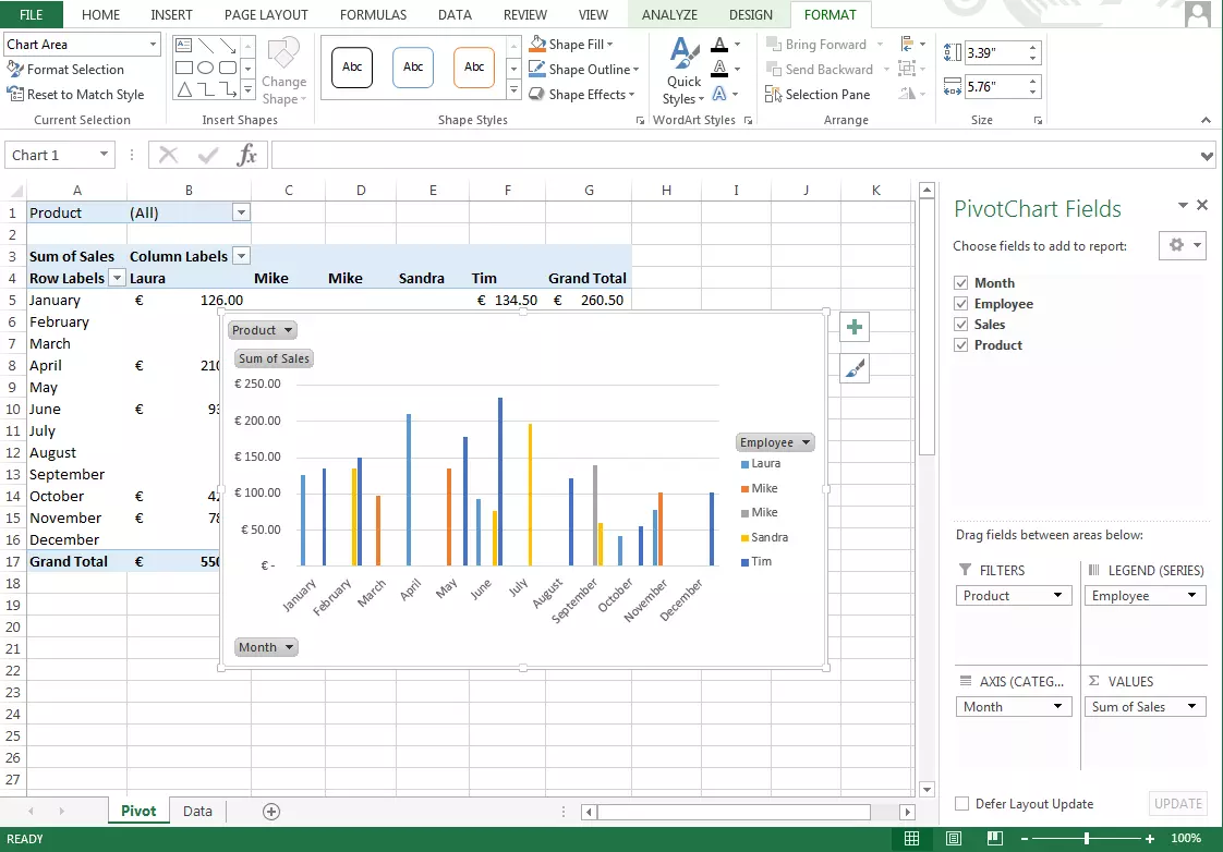
There are even more evaluation options: PivotChart provides an even easier way to display the results graphically. With just two clicks of the mouse, users can, for example, create a bar chart from your pivot table. These diagrams differ from the usual diagrams in that they can be adapted dynamically, just like the table itself. The pivot chart also provides filters. Making changes to the diagram will affect the table, and vice versa.
Other spreadsheets such as LibreOffice or Google Spreadsheet can also support pivot tables.
- Store, share, and edit data easily
- Backed up and highly secure
- Sync with all devices


